Windows 7 Taskbar – Here’s what to like and what not to

Every one has been singing praises for the new Windows 7 taskbar or superbar as some call it. Sure, the superbar brings refined navigation to the table, but is it really worth it? While it is very flashy and seems to provide more options to get your work done and switch between windows and launch applications, it provides a more visual experience rather than a more productive one. Opinion may differ, but I’ve been using Windows 7 build 6956 for some time now, and I’ll point out the issues I’ve had with the superbar.

Taskbar Button Flashing Windows 7 taskbarIf you are an avid IM user like me, you come around a lot of windows demanding attention, notifying you of new messages. In Vista, the taskbar button used to flash to notify you that its parent window requires attention. You just had to click it and you reached that Window. But, now in Windows 7, you have to click on the taskbar button, and then you click on the appropriate window preview to reach your desired window. It seems simple and only a click more than before, but at its current state, the taskbar flashing isn’t that distractive as it was in Vista. Maybe, it’s because the buttons are smaller, or maybe it’s just me.

Where are the windows I just opened??

Windows 7 Superbar 2

Can you really blame me for pinning so many items to the superbar? I love the pinning feature and depending on what I’m doing I keep moving them around. But, when I open an application that isn’t pinned to the superbar, I have to click on the bottom arrow on the far right, and then navigate to that window. That just makes things a little more hectic than before to navigate to your desired window. Maybe some sort of sliding mechanism for the taskbar buttons would be great. It could move with the mouse wheel from left to right or vice versa, making it quick to access your desired window. Also, the buttons could slide to the left and show the newly opened application making it easier to work with it.

Aero Peek
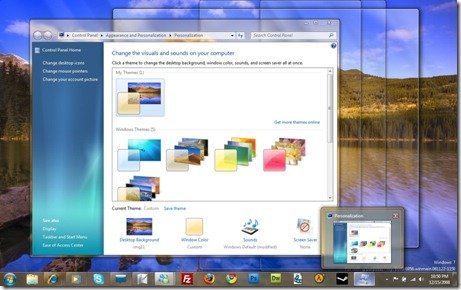
Windows 7 Aero PeekHonestly, I love Aero Peek. It’s a great feature, and I use it a lot! The only thing that annoys me about it is the big glass borders that sometimes hide text or parts of gadgets beneath them. This actually goes against its purpose as it doesn’t let you peek at them. Although it happens rarely, but this is something that could be fixed to improve usability.

I’ll give credit to Microsoft, the superbar is definitely a huge improvement and probably a much needed new feature to Windows along with the Aero Peek and Snaps. I do not believe its similar to OS X Dock, as both are still very different when the superbar is compared to it. The Dock is great in its own place. But the superbar really seems as the natural evolution to the taskbar of the older Windows Operating Systems. Even with the issues, I find with it, it is still a delight to use and provides a much richer experience than older taskbars.

About the Author

Technology enthusiast, Internet addict, photography fan, movie buff, music aficionado.

22 comments

  1. Having used OSX I’d like to point out this super bar is not something new, what happens in superbar has been happening in OSX ‘dock’ for quite some time.

  2. Having used OSX I’d like to point out this super bar is not something new, what happens in superbar has been happening in OSX ‘dock’ for quite some time.

  3. Khan – Actually, the “superbar” is actually a blatant ripoff of the KDE panel. Not every feature in Windows is actually a copy of Mac OS.

    Either way, you’re right. This is not anything new, and already the Linux community is largely pissed off about this “innovation” from Microsoft.

  4. Why the fuck would the Linux community care about what Microsoft is ripping off?

  5. Khan – Actually, the “superbar” is actually a blatant ripoff of the KDE panel. Not every feature in Windows is actually a copy of Mac OS.

    Either way, you’re right. This is not anything new, and already the Linux community is largely pissed off about this “innovation” from Microsoft.

  6. Why the fuck would the Linux community care about what Microsoft is ripping off?

  7. You must accept something, the superbar and Mac’s dock are not the same but they are very similar… I don’t care, I love them both and I’m happy of have it for Windows now

  8. You must accept something, the superbar and Mac’s dock are not the same but they are very similar… I don’t care, I love them both and I’m happy of have it for Windows now

  9. To b fair those two above were right. Linux has had ALOT of the “new” features for a long time… even before OSX. Also I dont think that the linux community does care, that is why they are still using linux.

  10. To b fair those two above were right. Linux has had ALOT of the “new” features for a long time… even before OSX. Also I dont think that the linux community does care, that is why they are still using linux.

  11. I loved the superbar, but i also agree that the ‘extra-clicks’ thing should be brought to notice of Microsoft.

    Also, I’ve noticed that the Linux comunity is really not talking about Windows 7 coz it’s much better than Vista. The L-community is slightly pissed off these days coz they’re finding nothing much to criticize, and all they really do is criticize and fault-finding….!

  12. Instead of deciding who is copying who for the stupid dock why don’t linux and mac copy the game compatibility of windows. WOOOT

  13. Apple never invented the mp3 player but they did perfect it. Microsoft has done the same thing with Apple’s dock ;)

  14. I loved the superbar, but i also agree that the ‘extra-clicks’ thing should be brought to notice of Microsoft.

    Also, I’ve noticed that the Linux comunity is really not talking about Windows 7 coz it’s much better than Vista. The L-community is slightly pissed off these days coz they’re finding nothing much to criticize, and all they really do is criticize and fault-finding….!

  15. Instead of deciding who is copying who for the stupid dock why don’t linux and mac copy the game compatibility of windows. WOOOT

  16. Apple never invented the mp3 player but they did perfect it. Microsoft has done the same thing with Apple’s dock ;)

  17. Why do we need this “superbar” , whats wrong with desktop shortcuts? :D

Comments are closed.