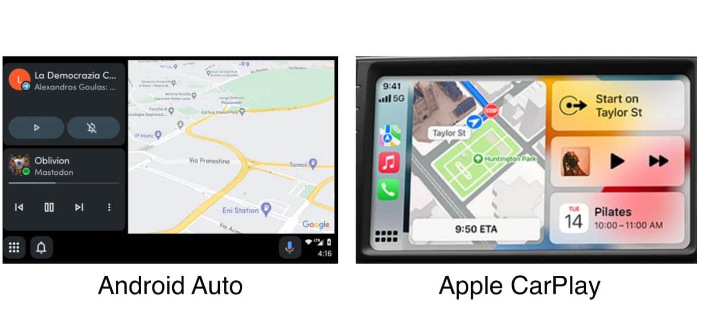
It seems that Google has taken a lot of inspiration from Apple’s CarPlay with its new Android Auto design. Internally codenamed “Coolwalk”, the new design has a panel-based layout, which puts different widgets on the same screen. This allows users to use Google Maps, while also viewing their music controls and sending messages to contacts.
Android Auto and Apple Play have the same purpose, which is to provide access to messages, calls, music, navigations, and other phone functions right from within the car dashboard. However, both offerings have had their own design and layout since the beginning.
Android Auto ‘Coolwalk’
Apple has continued to iterate on its CarPlay design that was first introduced with iOS 7 back in 2014, while Android Auto has seen a few design changes. Depending on who you might ask, Android Auto’s design has received a mixed reception from users over the years.
It seems that Google has finally found a solution to its Android Auto challenge. As per new images shared by Reddit user RegionRat91 and AndroidWorld, here is how the new Android Auto “Coolwalk” design looks next to Apple’s CarPlay:

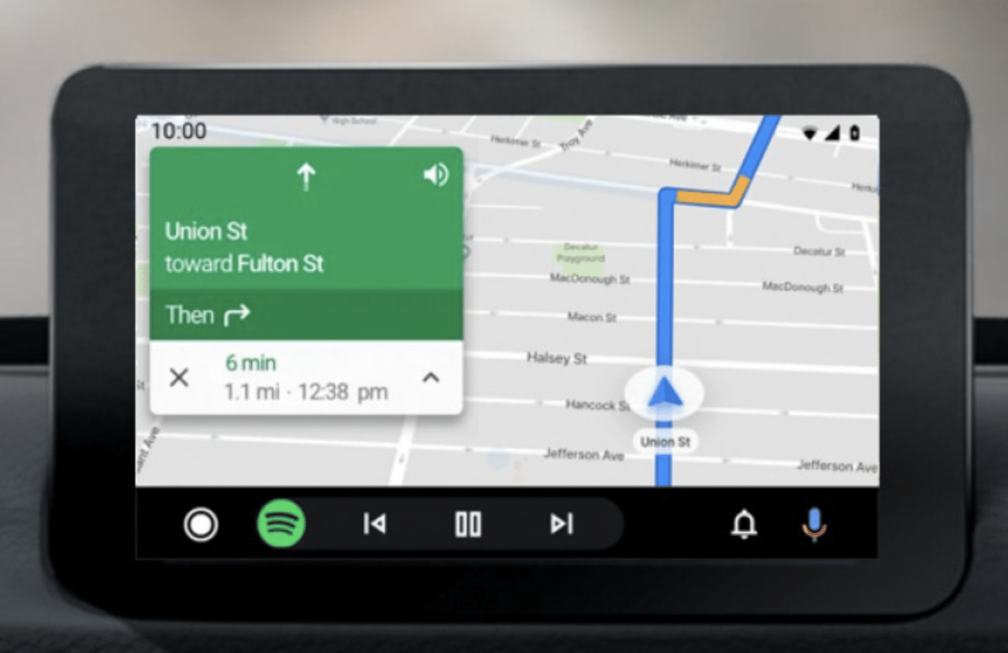
To put things into perspective, this is how Android Auto looks right now.

While the panels are the most obvious design changes, here is what else has been updated in this Android Auto beta.
- The new design removes the top status bar and moves it into a corner of the screen, similar to how CarPlay shows it.
- New button on the bottom left of the screen is used to open the home screen. Long pressing this button opens retractable widgets.
- You can finally respond to a call with a text message, instead of just hanging up or answering it. A much-delayed feature but it is finally part of this redesign.
- Android Auto would also support casting from an Android smartphone or a tablet. This supports casting the full smartphone screen but copyrighted material from services like HBO and Netflix is not supported.
Since this is a beta, it is possible that the final version might have a lot more changes. However, the design inspiration reminds us of the time when Apple called out Redmond for copying its OS design. With a little modification, that call out would be apt for this design copy too: “Mountain View, start your photocopiers!”