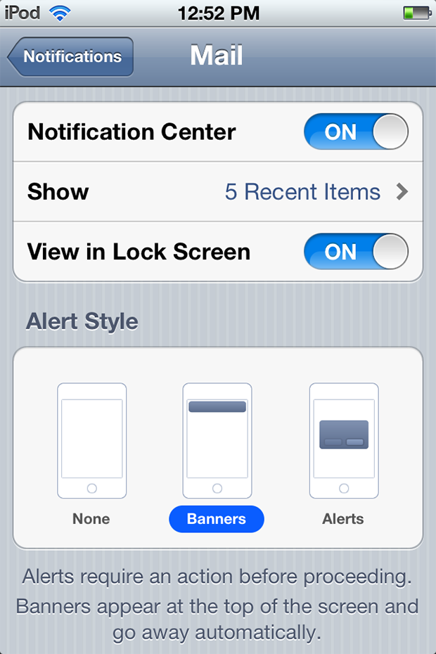
If you haven’t had a chance to try iOS 5 Beta on your own, then you may not have noticed the new round button on the toggles. In all the iOS version prior, the toggle was rectangular. I prefer the new round toggle switch, and there is a reason Apple chose those buttons.

Apparently, rounded corners are easier on the eyes and easier for the brain to process. It’s all science, your eyes can process circles faster than squares, so as humans we automatically prefer circular objects.
The rounded corners also cause your eyes to focus on the content inside of an object. But a square is the opposite, focusing your eyes away. So Apple has done us all a favor, making it easier for our eyes to focus on the buttons. The buttons allow our eyes to focus easier, and make a selection quicker.
So should we be mad that Apple made it harder for us to choose before with rectangular buttons, or do we praise them for making it easier now with the circular buttons? I’m going with praise, because the new buttons are great!
[via Gizmodo]


im thinking that too much focus on unimportant and useless features in iOS is pathetic.