At the WWDC 2022 event, Apple unveiled the upcoming iOS 16 update, and the first major feature that stands out of the most was the new Lock Screen. After giving users the freedom to personalize their iPhone Home Screens with widgets, wallpapers, and more in iOS 14, the personalization experience has now expanded to Lock Screen; for the first time, iPhone users can change the color and font of the clock, add widgets, notifications stack up from the bottom and much more.
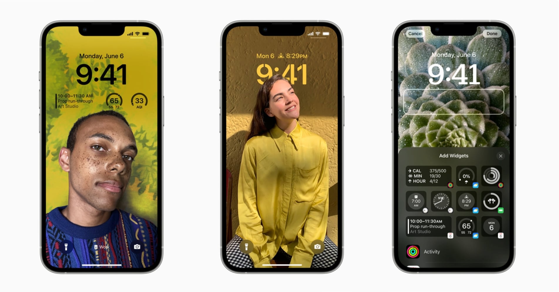
Apple Senior Vice President of Engineering, Craig Federighi, and Vice President of Design, Alan Dye discussed the concepts and ideas that led to deciding and developing the upcoming changes to the iPhone Lock Screen on iOS 16 with TechRadar over a video conference.
Federighi explained that personalization options introduced in iOS 14 paved the way for the major Lock Screen update which was created out of love. He said:
“We knew this was a multi-act play, and we knew our next venue would be the Lock Screen.
We saw a real opportunity to take that area that really has evolved slowly over time but has never seen this kind of massive step forward, and to do something really big — but something very Apple and very personal. So, this is an act of love this year.”
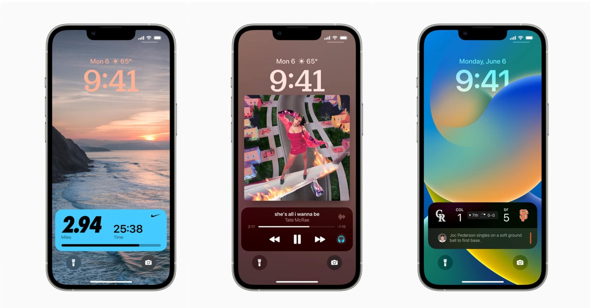
All the changes to the Lock Screen on iOS 16 are designed to deliver the iconic yet completely new “magazine look”
Sharing the design philosophy behind the new Lock Screen, Alan Dye said that their goal was to deliver changes that would offer a personal experience while maintaining the “brand recognition Apple is known for” so that changes don’t feel forced.
“Our goal,” Dye told us, “was to make the iPhone even more personal – and definitely more useful – but also keep intact those key elements that make iPhone, iPhone.”
More than once Dye said that the Lock Screen is a key part of “the icon of the iPhone.”
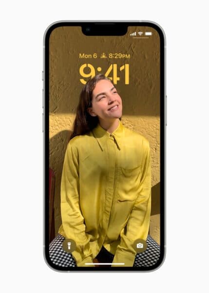
The center-alignment of the clock, which represents the iPhone’s 15-year-old legacy, was not meddled with because is an iconic element of the iOS experience but the font, color, and style personalization options were introduced.
Previously, users were able to set a photo for their Lock Screen wallpaper which they had to manually change. With the dozens of neural networks on iOS 16, users will be able to not only create multiple Lock Screens showcasing different images for different moods or occasions but also offer a gallery of Lock Screen to browse through suggestions before finalizing a photo.
Choosing and suggesting Lock Screen-worthy photos is one thing, but with iOS 16, Apple is making the images – or rather the subject – an integral part of the interface.
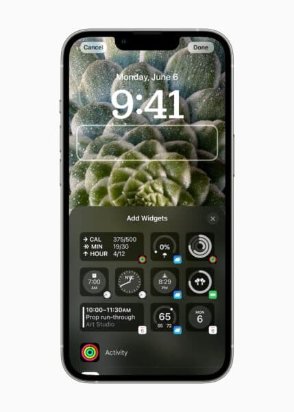
The new widgets on the iOS 16 Lock Screen are inspired by the complication of Apple Watch faces to use the space more productively and provide important information at a glance. Dye said:
“Of course, we took a lot of inspiration for Apple Watch complications in designing these widgets that make it very easy to get information at a glance.
“There’s no question – one of the benefits of having one design team that works on every product and the design across all of our products, we learned a lot about glanceable information and how to portray that over a variety of different images,” he added.
The new swipe-up notifications stack at the bottom of the Lock Screen UI not only brings a cleaner look but also keeps the focus on the subject of the wallpaper.
“For a lot of us this getting the notifications down at bottom of the phone below the photo is just so changing the feel of the Lock Screen,” added Federighi, “because in practice, so many of us – what our phone mostly looks like is all of its personality is obscured by a list of text, a bunch of notifications.”
And it might mess with that “magazine cover” look and feel.
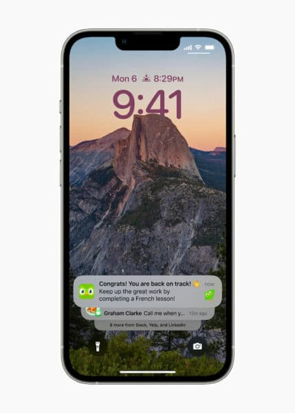
All of the new changes to the Lock Screen on iOS 16 will allow users to create a unique “magazine look” to showcase their personality and preference on the front of their iPhone.
That “magazine look” is achieved through a collection of new controls and customizations that bring together the revamped time, widgets, photos, and deep technology that both identifies good Lock Screen images and can meld them with elements in new ways.
Furthermore, other innovative features like removing the subject of an image from the background and sharing it via Messages are driven by the neural engine, and Focus modes integrated with Lock Screen will allow users “to connect with what sort of frame of mind they are in or want to be in at the moment.”
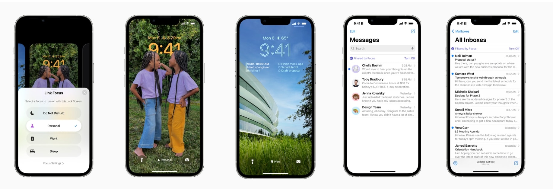
TechRadar concluded that the new iOS 16 Lock Screen design updates are still very Apple; “I’m an iPhone, made by Apple.”


