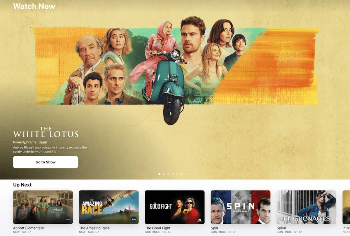
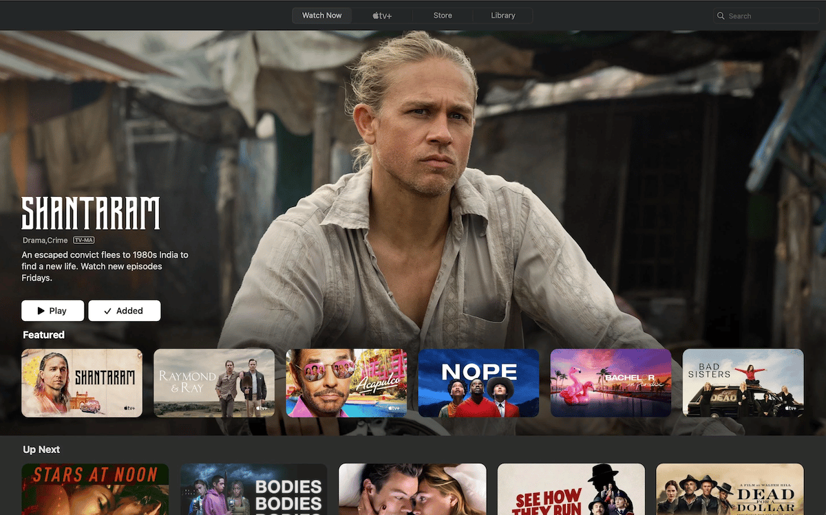
Apple TV app has introduced changes in its layout design to push featured content to viewers on the beta of iOS 16.2, iPadOS 16.2, tvOS 16.2, and macOS Ventura 13.1 updates. In the new beta updates, the Apple TV app has moved the “Featured” row before the “Up Next” row.
Apple TV app available across devices features content from Apple TV+ and third-party video streaming services likeDisney+, HBO Max, Hulu, Prime Video, Peacock, Paramount+, SHOWTIME, Noggin, Starz, and others.

Apple TV app users express discontent with the new UI design
As the “Featured” row or section on the TV app displays Apple TV+ original shows and movies, it appears that the tech giant changed the app’s UI design to market its own content. And some users are not happy.

After sharing the image of the new design, Reddit user@robber3572 wrote that it was intrusive and annoying.
I don’t mind the discovery aspect, which I agree is what the tv app is all about. It’s highlighting this featured content above (literally and figuratively) the content that I watch on a regular basis that’s annoying and intrusive. This featured content is now prominent in the tv app and it highlights shows/movies I would never have an interest in watching. This is the same way featured content is displayed on the Nvidia Shield, Fire TV and CCwGTV home screens.
I have no problem with the “what to watch” row that currently exists in the public version of tvOS, but by now making that the key/hero imagery anytime I open the tv app no longer makes it personal.
@spiraled0ut wrote, “Looks like I’m turning off auto-update. This is really bad.”
Read More:


