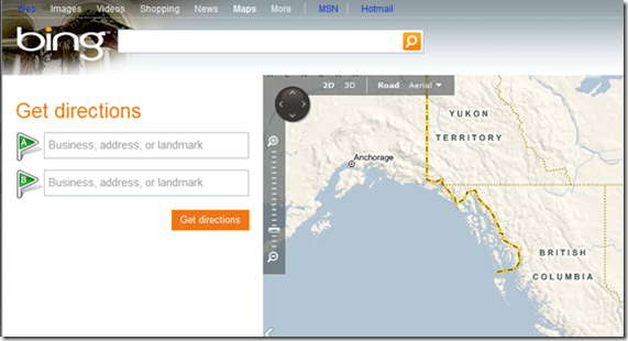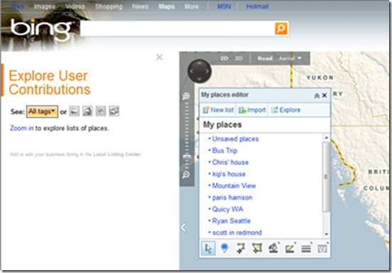
Did you see Bing Maps today?. If not, then you should go ahead and have a look at it by yourself. You will get a surprise, a pleasant one that is. The reason being, Bing Maps Interface just got cooler than before. Bing team has revamped the look and feel of Bing maps giving it a slicker look
What’s new in Bing Maps
Following are the notable changes that today’s update to Bing Maps brings:
- A simplified Navigation Bar.
- Get Directions feature now has a prominent look on the maps page.

- Placement of a set of icons at the bottom of the page (Shown below). This collection of icons offer users cool choices to play with.
![]()
Starting from left to right are icons for Welcome Page, Directions, My Places (previously called Collections), Share, Print, Traffic. The features that these icons offer are pretty much self explanatory from their names.
There is an option called Explore user contributions under the My Places option. This enables users to sort out their contributions according to one of the following options
- Items with pictures
- Items with 3d Buildings
- Items with MapCruncher Layers
- Items with Photosynths.
With Bing maps now bringing a sexier look and feel, there is no doubt that many users might be thinking of leaving Google Maps and use Bing Maps for their navigation purposes. However Bing should consider updating its Maps and add more places to have a better chance to compete with Google Maps.

(images via LiveSide)
How to disable “Get Directions” feature that now has a prominent look on the maps page?
There's a small arrow right under the zoom control on the map that hides the 'Get Directions' pane.
How to disable “Get Directions” feature that now has a prominent look on the maps page?
There's a small arrow right under the zoom control on the map that hides the 'Get Directions' pane.