In a few weeks, all U.S. users of Bing will see spring refresh changes in the UI. Initially the changes will roll out to just 5 percent of users and spread out to everyone in the US. These changes for the time being would be just for the U.S. as Bing maintains different versions of Bing for different parts of the world. The main noticeable change in the new refresh would be of its user interface. Check out the screenshots of the new Bing interface.
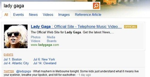
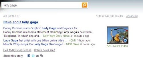
One of the biggest changes in the new release of Bing would be of a new “Bing box” which will have real-time results in a single pane. The two screenshots below compare the search results of “Lady Gaga”. In the upper screenshot we have the new upcoming Bing UI and we have the current version of the Bing in the screenshot below it. On searching “Lady Gaga” in the new Bing UI, it shows her photo, official site, upcoming live events and her latest tweet.


Another new feature would be that it will have Quick Tabs of popular query results just below the search box which will help users to find more news, images, videos and other related content types as shown in the screen shot below.


Another new addition that I saw in the screenshots of the spring refreshed interface is that on searching “Lady Gaga”, it shows Related Artists. So Bing automatically identifies that Lady Gaga is an artist. This feature would also help users find out things related to their search for example if I am searching for any book, then apart from getting the search results about my book, I would also be able to see books related to search query.
 Microsoft would also add a new “Comparison Answers” capability to the Bing engine, with sports being the first category for which this functionality will be available. Microsoft officials also said auto suggest improvements would also be added for all Bing mobile users, providing faster results for queries for common topics.
[via blogs.zdnet]
The new interface looks rather interesting. Better than Google’s plain-o looks anyway.