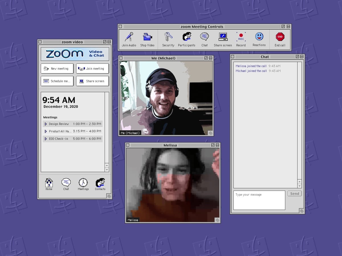
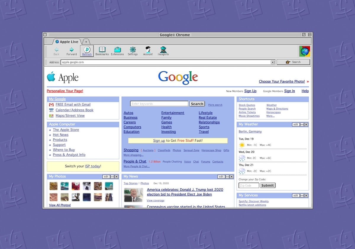
A new Mac OS 9 concept by designer Michael Feeney shows how the operating system and currently popular apps would have looked like if they were made in 1999. Dubbed (mac)OStalgia, the concept shows apps like Spotify, Slack, Zoom, Chrome, and more in action.

This Mac OS 9 concept shows what if Slack was launched in 1999
Alongside his graphical expertise, Feeney utilized SheepShaver, a Mac OS 9 emulator, which helped him analyze the operating system which was launched in 1999. This was the last classic Mac OS update before the modern OS X operating system was first launched.
To help me understand how modern applications would have looked liked in the Mac OS 9 era, I had to start analysing the OS in greater detail. After all, the last time I had used Mac OS 9, the word hipster had not even been reappropriated yet. The Mac OS 9 emulator SheepShaver has been of great help to help me analyse Mac OS 9 in its greatest details.
Here are all the apps that you can see in action in (mac)OStalgia:
- Spotify
- Slack
- Chrome
- Zoom
- Figma
- TextEdit

The app shows apps like Slack using an iChat-like interface, with a contacts list in one view, and individual chat windows. Even the Zoom app is broken down into multiple windows with each component like call controls, chat messages, and the videos themselves appearing in individual windows. In the spirit of keeping things realistic, the concept even shows glitches during a Zoom call due to network issues.
In case you have used Mac OS 9, or even an old Windows operating system, you are bound to be filled with nostalgia after watching the concept video. Especially for users who had used Mac OS 9, the concept shows a lot of attention to detail in imagining how modern apps of our ear would have translated to classic design languages and operating system paradigms.
Check out the complete concept video below: