Alongside a new design, you can now enable Facebook dark mode on desktop, in Chrome and Firefox web browsers. The update is not available for Safari and mobile web browsers yet, even though the new design works fine in responsive mode.
Dark mode is all the rage nowadays because of many reasons: it saves energy, blurs the background to put the focus on content, and is aesthetically pleasing to use. Facebook dark mode applies to all elements of the website seamlessly, for example, on reaction emojis, comments, profile pages, etc. Along with the dark mode, Facebook has also implemented a brand new design that seems suitable for touch displays, especially on Windows laptops and tablets. We have listed down the steps on how you can enable Facebook dark mode in Chrome and Firefox.
How to enable Facebook Dark Mode
- Log in to your Facebook account.
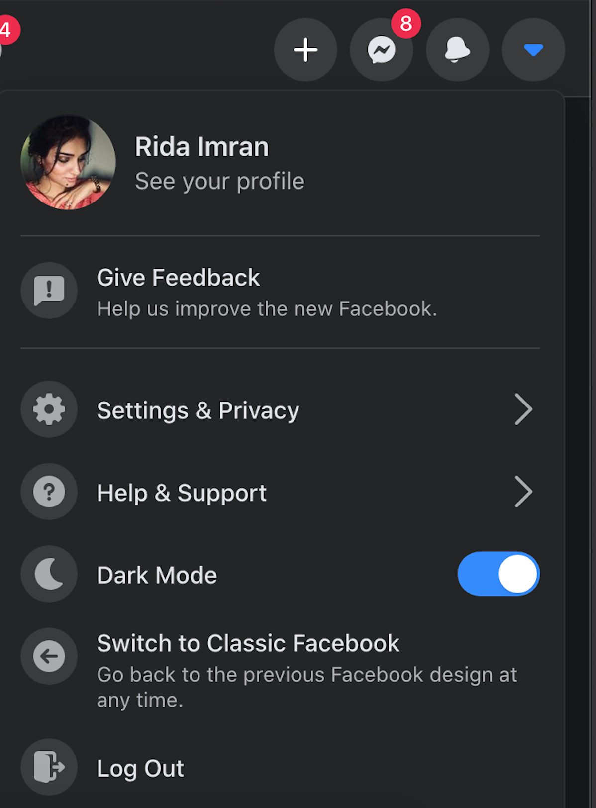
- In the top right corner of the menu bar, click on the down arrow to open the settings menu.
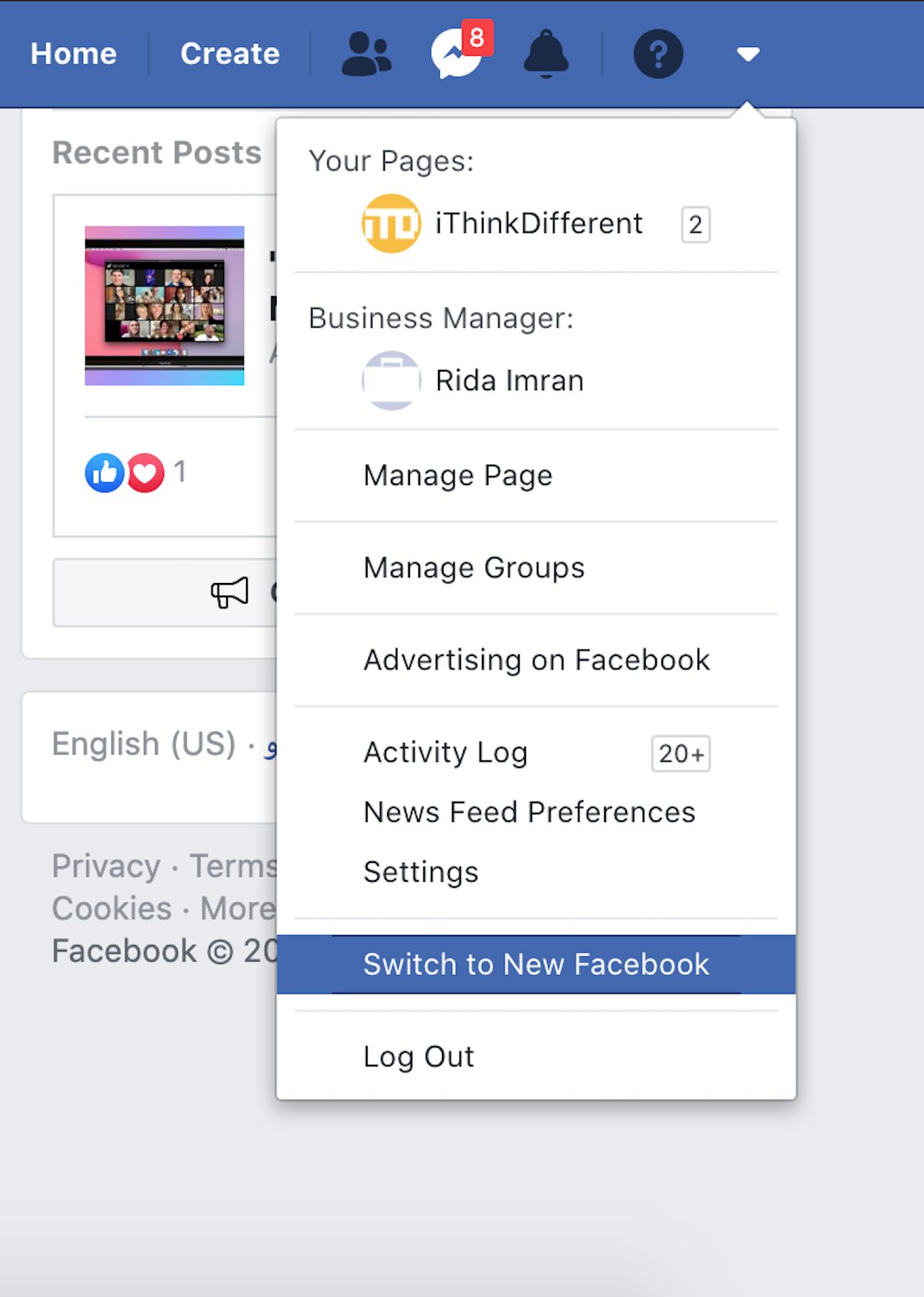
- Scroll down and click the ‘Switch to New Facebook’ option.
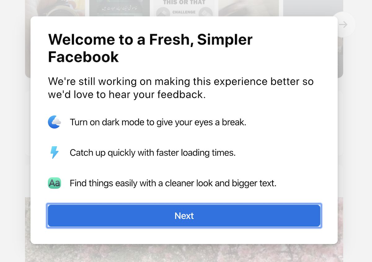
- You will be directed to a message which explains the features of Facebook’s new look. Click on ‘Next’ to proceed.
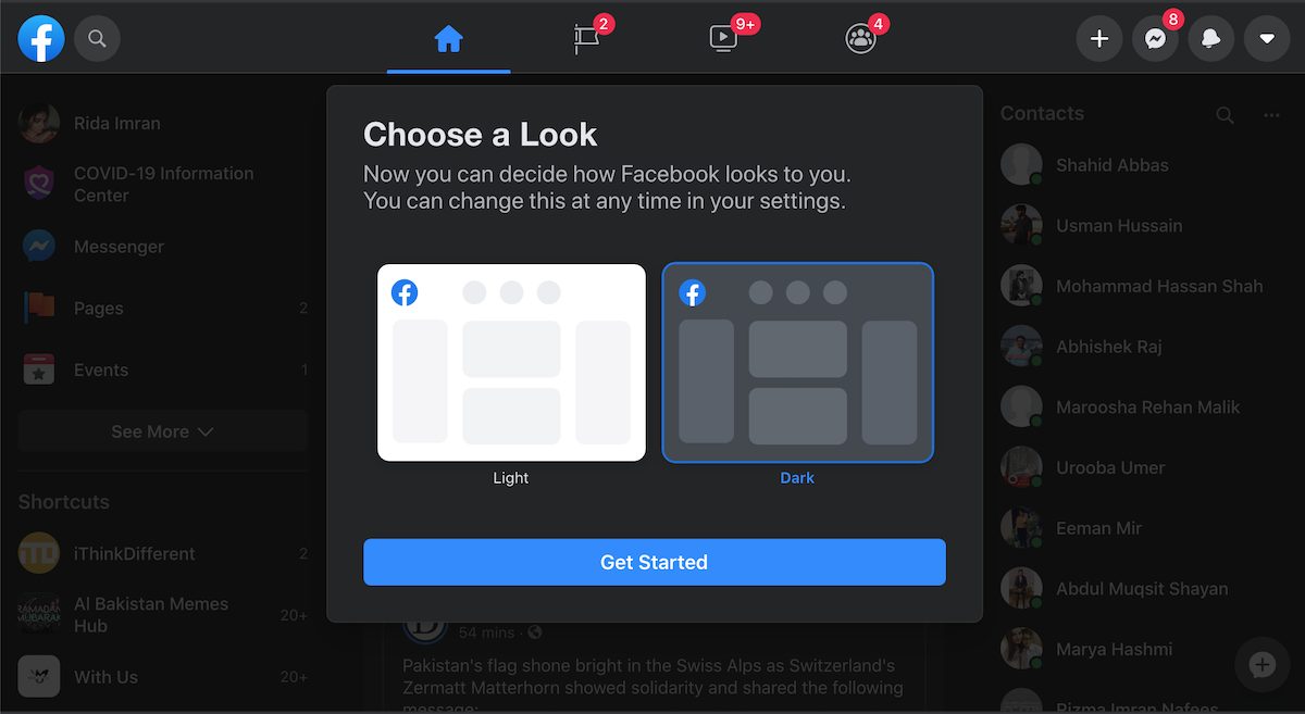
- Two theme options will appear on the screen. Select either Light or Dark theme from here to switch. Note that the Facebook website does not support automatic dark mode switching based on your global operating system setting.
Facebook new design
Along with the new dark mode, Facebook has also gotten a new design after a long time. The company calls this new design as ‘fresh and simpler Facebook’. According to the company, the new design delivers a better user experience with faster loading times and cleaner and larger fonts.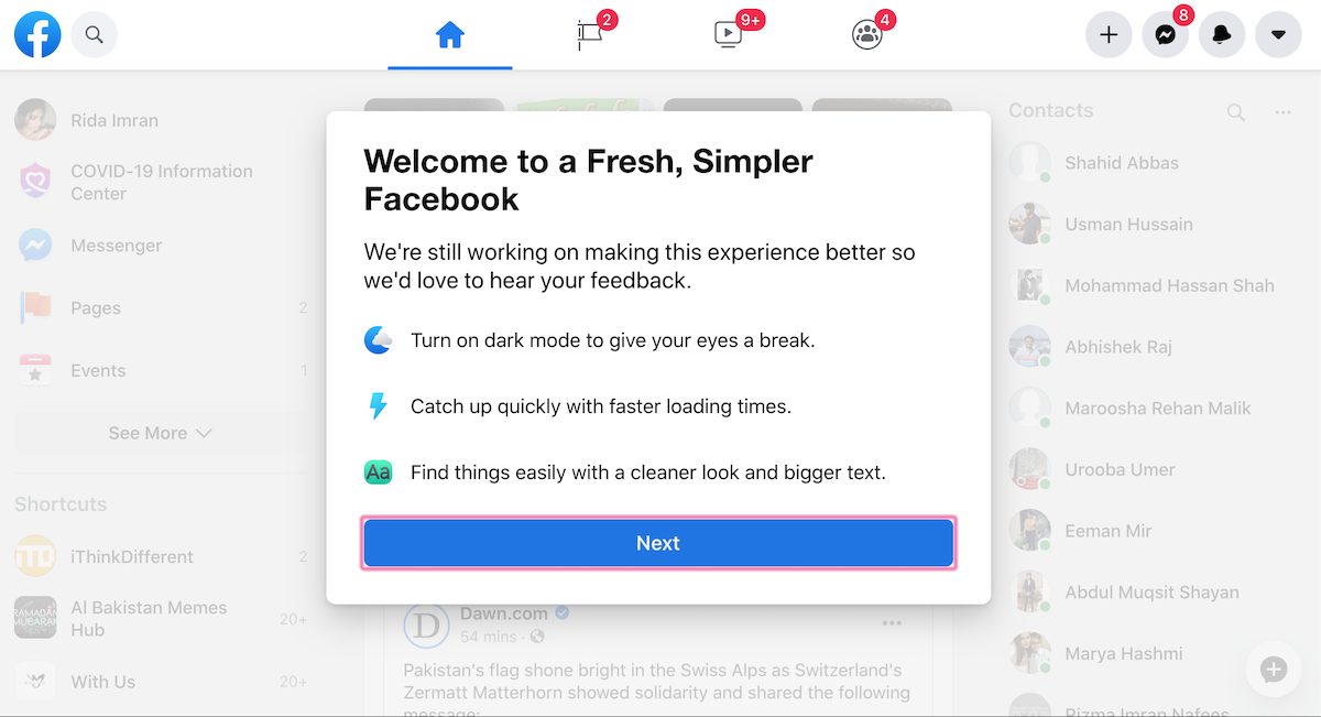
Switch back to classic Facebook design
- Simply click on the same downward arrow, to access the settings menu.
- In the menu, click on ‘Switch to Classic Facebook’. This will also disable Facebook dark mode, as the classic design does not support it.
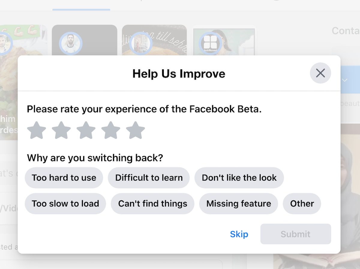
When changing back to classic design, users see an optional survey asking users to rate the new design and experience, and also reasons for switching back. Having used the website in both new and classic designs, I personally liked the bigger and bolder layout of the new design with its dark and light themes.
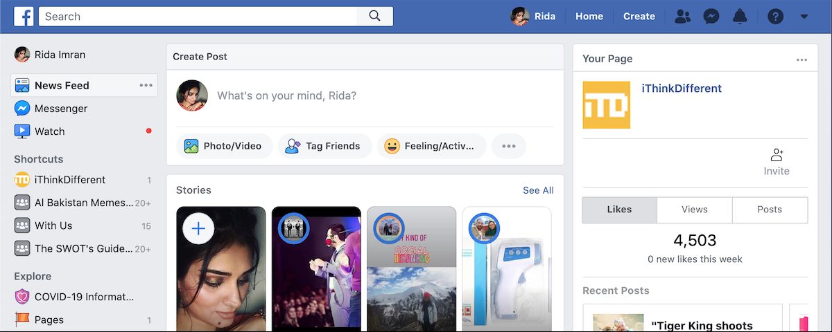
The layout and functionality of the new design are different from the former design. Not only is the text bigger, but other features are also different. Some examples include: the search bar is smaller, and you can see the names of the users for each reaction on a post.

Dark mode is definitely easy on the eyes, therefore, over the past year, we have seen different platforms and operating systems introduce the theme. Recently, via a few hidden tweaks, it was discovered that Facebook dark mode for iOS app is in development too.
Update: Facebook has officially announced that the new design, along with dark mode, is rolling out to all users today. The new design is still not available for Safari users though, and the official blog post makes no mention of it.
3 comments
Comments are closed.