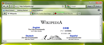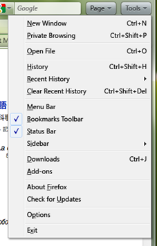
Firefox has the worst UI amongst all the popular browsers. Almost all other browsers ( IE, Chrome, Safari ) have a new and better UI along with some sort of Windows 7 integration ( Aero Glass, jumplists, Aero Peek, thumbnail previews etc ), where as Firefox has none. The UI is still stuck in the Windows XP era. Mozilla has plans to change all that with Firefox 3.7 release.

Starting with Vista, and continuing with Windows 7, the menubar is going away. To be replaced with things like the Windows Explorer contextual strip, or the Office Ribbon(now in Paint and Wordpad too). Many apps still retain the menubar as an option to be pinned or to be shown briefly by holding the Alt key.

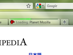
A new “Progress Line” to indicate tab load progress:
Instead of the indeterminate progress indicator in use now, we would like add a progress “line” under the location bar on the active tab and at the top of each background tab. This will let people know about how much longer their background tabs have until they load and it also looks cool.
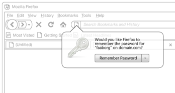
A new notification system is also planned which will be further enhanced in Firefox 4.0

All these changes to the UI will be ground work for more changes coming to Firefox 4.0 down the road which would look something like this mock up :

[via Hardware 2.0]
Good post Imran. I have also done one this morning on this very subject. http://technograns.wordpress.com
I like these changes, the only thing I'm worried about is the Bookmarks menu. I have over 1,000 bookmarks that are critical to me and I need quick access to my organized structured I've created over the years.
I would most likely be able to welcome or get used to some of the design changes, but only if there’s a guarantee that those “Page” “Tool” etc. buttons can be moved around (are not stuck in only one position) and that the items in them can be edited via addon.
Good post Imran. I have also done one this morning on this very subject. http://technograns.wordpress.com
I like these changes, the only thing I'm worried about is the Bookmarks menu. I have over 1,000 bookmarks that are critical to me and I need quick access to my organized structured I've created over the years.
Limi says no to the ribbon: http://twitter.com/limi/status/4334320611
I need the the live writer back PLEASE!