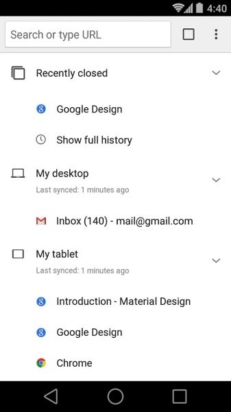
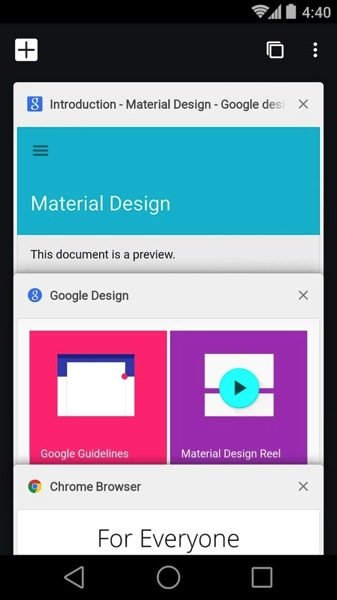
Google has updated Chrome Browser for Android with a Material Design update which includes flatter graphics as well as new animations. The design update also brings a bit of reordering of the user interface elements which might not please all users.


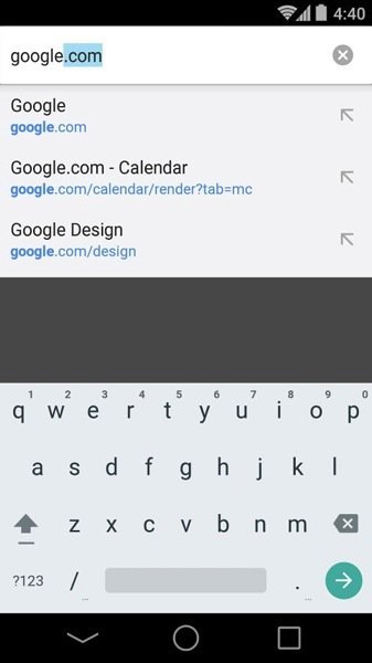
Google had updated the beta Chrome version in Play Store with Material Design not so long ago. If you been on the beta version, you wouldn’t notice anything new. Otherwise, along with the design updates, the user interface now has a hidden refresh/stop button, located in the menu. The home page tab is also different than what we were used to. The URL bar now appears in the center of the default home page tab and moves to the top when tapped.


Overall, a lot of users might agree that this update is mostly about form over function but that is what Material Design is mostly about – to beautify the interface, at the cost of hiding controls under layers or adding slower animations.
The update is available for Android smartphones and tablets.


