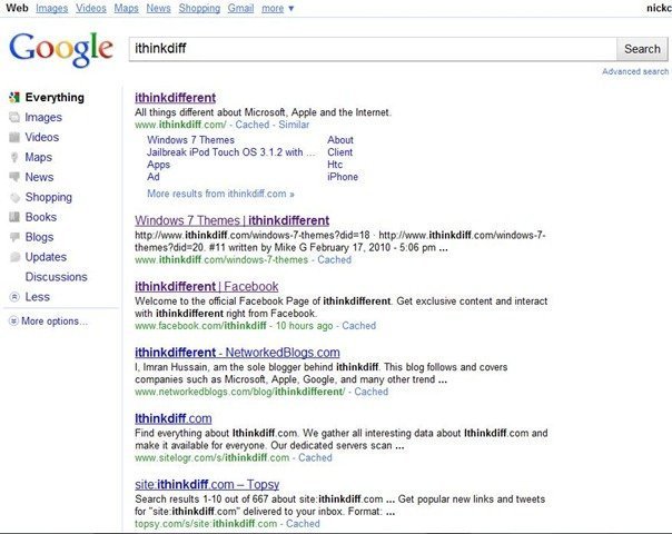
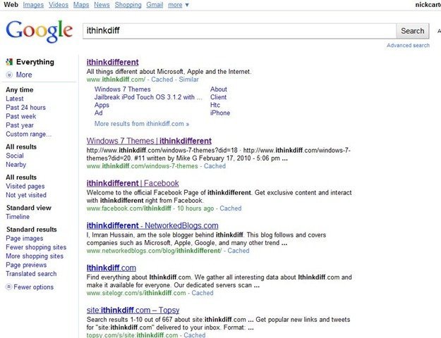
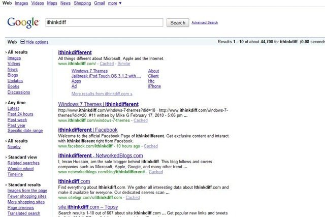
While doing some ‘ego searching’ today, I stumbled across this new Google Search results UI. It looks a lot cleaner than the current UI and a lot less colorful as well. The currently search selection has colored buttons while other search types have colorless images. Weirdly though, navigating to either of them brings back the old UI.
The search bar is a lot longer now, I guess that’s because lots of people search for long queries and not just short keywords. The button style has also changed and looks cool.

The ‘realtime’ search options as well as different filters and views are available via the More link.

Does it look better than the current Google Search UI? I think yes. It looks a lot less cluttered.

It seems that this is a work in progress (since last year). There’s a trick posted over at Gizmodo to access it.
Thanks to @blogsdna for the Gizmodo link.
Looks similar to Bing’s search results UI
i read about it a year ago on a blog calles zjtechlive