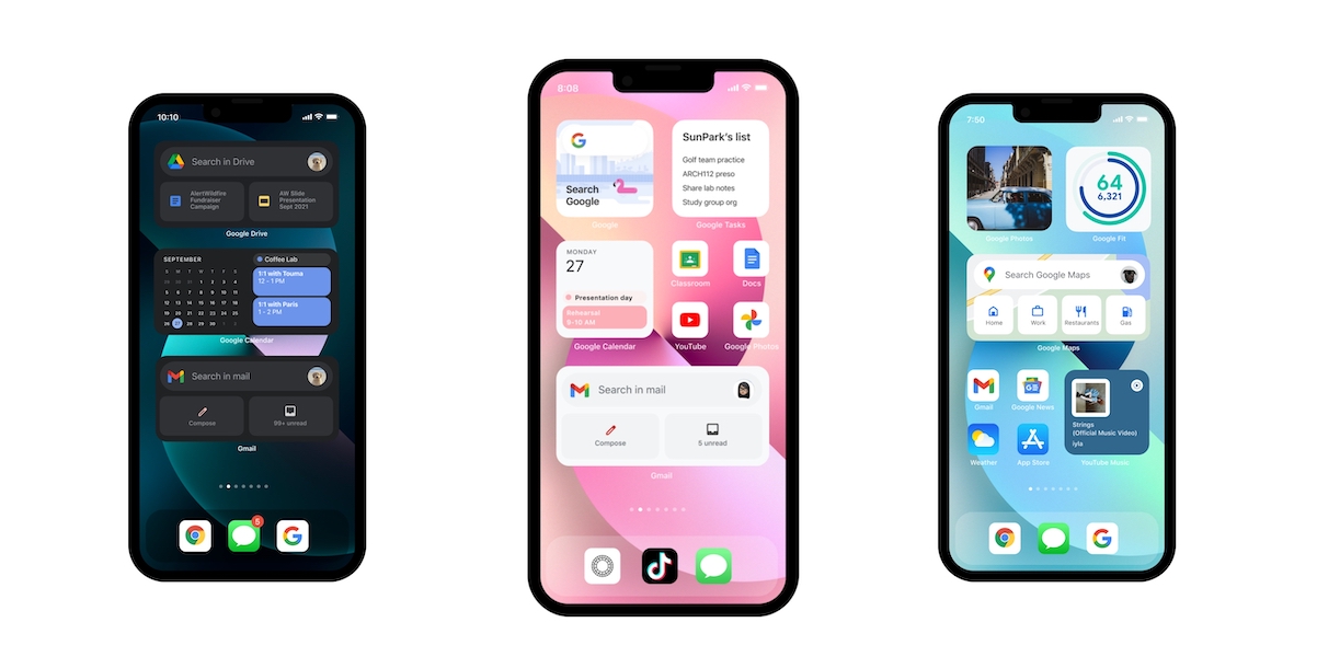
Google has finally decided that it will ditch its cross-platform Material Design for its iOS apps and adopt native design elements moving forward. This means that Google will finally embrace Apple’s native iOS design language and guidelines to fix the issues in its apps that resulted in a lack of gesture support, native buttons, and other odd behaviors.

Google will finally do justice to its iOS apps
The announcement has come through Jeff Verkoeyen, staff engineering lead for Google Design on Apple platforms. Jeff announced that his team has put its open source Material design component libraries for iOS into maintenance mode, in favor native iOS UIKit components.
So at the beginning of this year, my team began a deep evaluation of what it means to build a hallmark Google experience on Apple platforms by critically evaluating the space of "utility" vs key brand moments, and the components needed to achieve either.
— Jeff Verkoeyen (@featherless) October 7, 2021
Jeff’s reasoning behind Google’s non-native approach over the past decade was attributed to a “need to fill gaps in UIKit’s design language”. He went on to say in his Twitter thread that Google’s libraries drifted away from Apple’s platform fundamentals over time, while UIKit kept improving and closing the gaps that the Google Design team was aiming to close with its libraries.
At the start of 2021, Jeff and his team evaluated how a “hallmark Google experience” on Apple’s platforms meant that they did not need to use custom components anymore. Google could simply use UIKit and skin them with Google’s own branding. This would keep the experience native and match user’s expectations on iPhone and iPad, while still keeping Google’s look and feel intact.
Jeff also said that the time that Google is saving by not building custom code can be invested in making the company’s iOS apps feel great on Apple platforms.
The time we're saving not building custom code is now invested in the long tail of UX details that really make products feel great on Apple platforms. To paraphrase Lucas Pope, we're "swimming in a sea of minor things", and I couldn't be more excited about this new direction.
— Jeff Verkoeyen (@featherless) October 7, 2021
This news has been met with a sigh of relief as iOS users have always complained about the design issues with Google’s apps. They have always felt like Android apps on iOS and ignored the platform guidelines and conventions that users adore.
Jeff also retweeted a tweet by Rizwan Sattar, who works on Photos at Apple. The tweet said that it’s better to keep the UI/UX of an app consistent with the platform, rather than make it generic and cross platform. In the end, it does not save you time and effort, but costs you more.
Also, in my opinion, it’s always better for your users to try to keep your UI/UX consistent with the platform, and not stick strongly to some generic brand style “just because”.
Just like with cross-platform app dev tools, you think it’s gonna save you time/effort. It won’t.
— Rizwan Sattar (@rizzledizzle) October 8, 2021
It is unclear when Google will roll out these updates to its apps. The company has already put its Material iOS libraries in maintenance mode, as of July 2021. This likely means that future Google app updates for iOS will start moving to this direction, however, considering how long it took the company to roll out dark mode for Gmail, we will not be holding our breath.