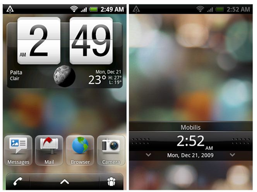
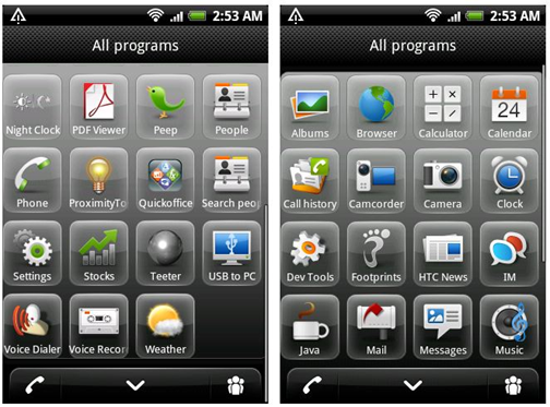
 Apparently someone has leaked the images of the upcoming update to the Sense UI in HTC Espresso, the successor to the HTC Dream. Normally, we use the words amazing and pretty with HTC’s user interfaces, but it seems like someone has lost their way at HTC. The icons are now surrounded by bubbles which look very tacky. And the bar at the bottom has gone from good to bad as well. Take a look at it yourself:


Apart from the UI changes, an interesting addition is the inclusion of a ‘people’ UI. The button shown at the bottom right opens it up. Speculation is that it may provide quick access to social networks but we’re not sure.
For the sake of aesthetics and the reputation that HTC has recently build up with beautiful UIs with Sense UI and TouchFlo3D, I hope the looks of this update will change.
hmm, I totally disagree with you. I really like the look of the icons…..
hmm, I totally disagree with you. I really like the look of the icons…..