Everyone on the planet probably knows by now about the new iPhone X, pronounced 10, not EX, because iPhone 9 was not important. The phone looks strikingly futuristic and beautiful. The new A11 Bionic processor is amazingly fast, iOS looks great on the new OLED display and Apple just sold it really well. So, like most people, I would love to get my hands on one, once my kidney auction goes through. However, I still have not been able to come to terms with the notch that Apple decided to put on the top of the “bezel-less” display.

Why does the iPhone X have a notch? It houses the new TrueDepth camera system which enables Face ID. The system comprises of an infrared camera, a dot projector and a flood illuminator.
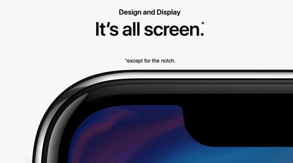
Twitter, along with other social media, is divided on whether the notch looks good or not. Apple was careful to avoid showing any app during their presentation which would look weird with the iPhone X notch, however, on their website, you can see the following:
Sup, Notch. pic.twitter.com/mXLHANXhZg
— Imran Hussain (@imhassan) September 12, 2017
It bothers me that content will be covered. If I have a display, I want to see all of it. That’s what we have been used to, since, forever. If you too, like yours truly, are unable to embrace the notch, here are some ways to train your eyes to avoid seeing the notch. Once you start seeing it on all displays, it should look normal. Join me on my journey to #embracethenotch.
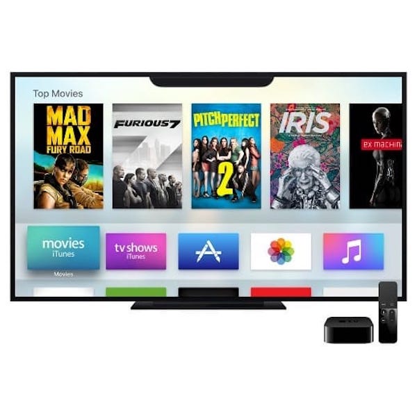
Here is Apple TV with all its glory and the notch.

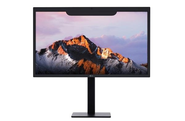
Here is a computer display with the notch. I use Windows on my computer so maybe I could get used to some of it being hidden. Unless I get a headshot in Overwatch because I could not see Hanzo behind the notch. Damn Hanzo.

See the world differently.™️

Even Nintendo Switch could join on in the fun. If they could add a camera in the notch for some even wackier ways to play games, why not?

I hope that the notch would become all but invisible to me very soon.
Jokes aside, Apple could have made the complete status bar black, instead of wrapping the user interface and content around it. Not only would this make the notch unobtrusive, the overall look and feel of the device would improve. Just look at the curvy user interface.
Apps that embrace the notch on the new iPhone X look bad. Look better with a black background for the status bar. Quick comparison #iphonex pic.twitter.com/3o4bJQC4NB
— Carlos Gavina (@carlosgavina) September 12, 2017
Rant over.
1 comment
Comments are closed.