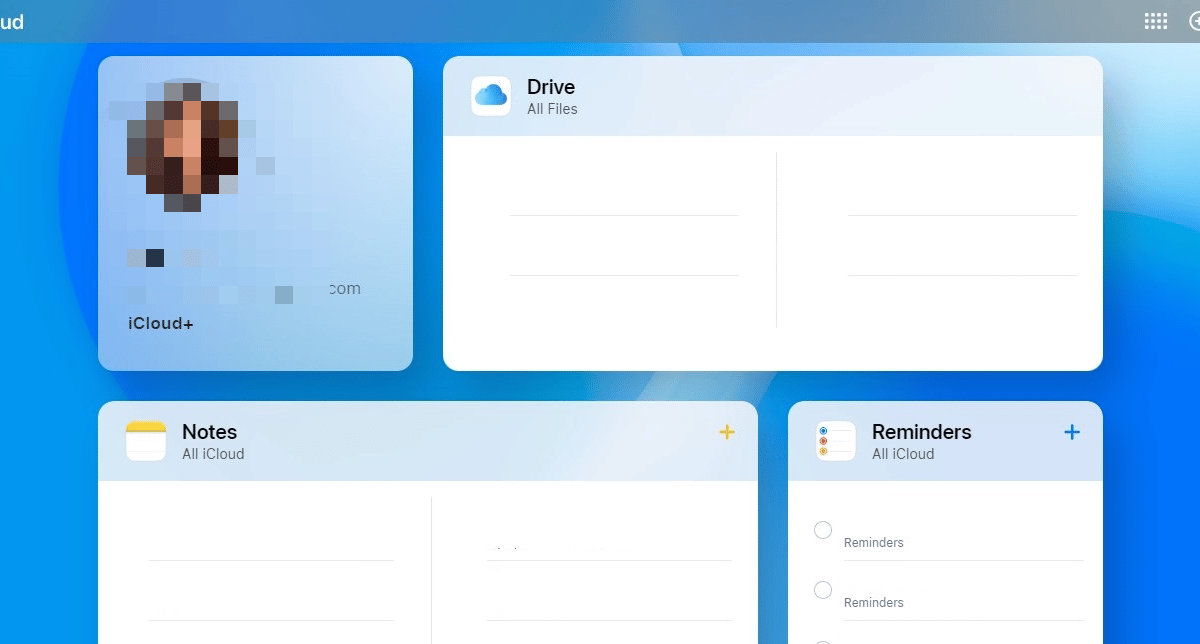
Apple has just rolled out the new and improved iCloud.com with a much-needed facelift. The webpage now displays all of your important information at a glance with tiles for Apple ID, Photos, Mail, Calendar, Notes, and more.

iCloud.com gets a significant facelift
Apple has completely redesigned the iCloud webpage from the ground up. Not only is the new interface cleaner and much nicer to look at than the previous version, but it also feels more in line with the visual direction Apple is going in.
The best part about this redesign is that the webpage for iCloud is now fully customizable. Users can pick and choose any tile they want to add to the homepage of iCloud.com. The bottom of the webpage shows your iCloud storage plan and your storage. The bottom of the page also offers a quick way to access Data Recovery options.
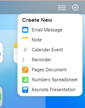
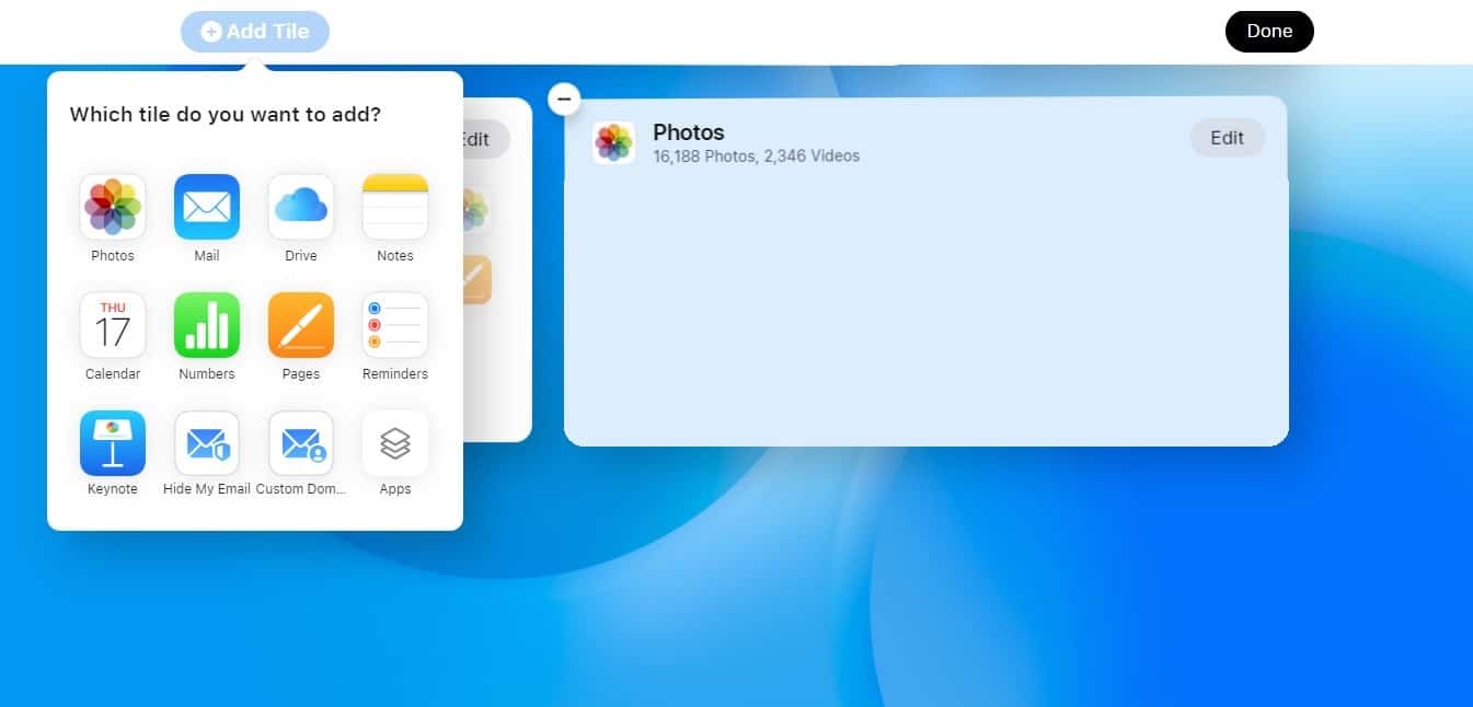
As for the tiles, by default, Drive, Notes, Reminders, and Photos are displayed. You can also add Mail, Calendar, Numbers, Pages, Keynote, etc. There are also two options at the top of the interface, in the menu bar. One lets you open any app and access iCloud+ features. The other lets you create a new Email message, Note, Calendar event, Reminder, and more.

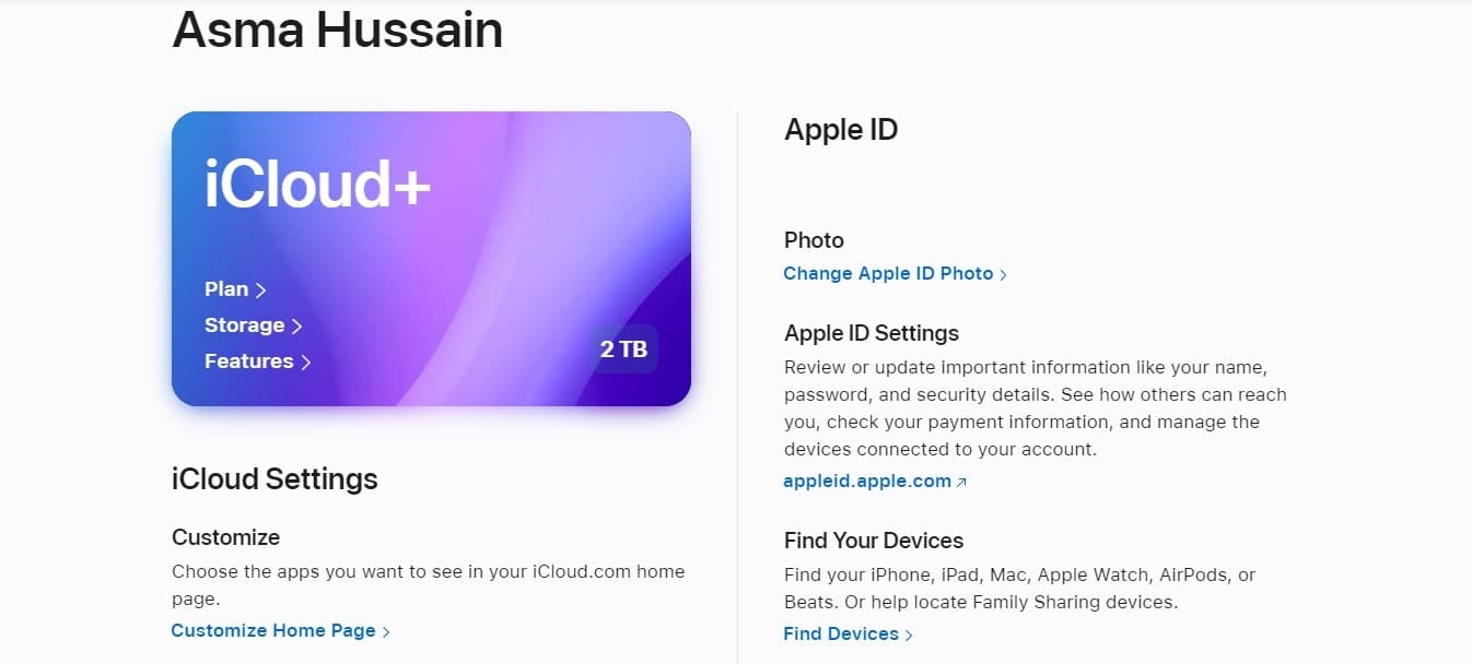
Clicking on a tile will load a page for the app you want to open. For example, you can see down below that my Apple ID information is displayed in a way that lets me quickly access important settings. All I had to do to access this page was click on the Apple ID tile.

At the bottom of the bottom, there is an option you can tap to customize the page. This option allows you to add, remove and move tiles around to create the perfect layout that is tailored fit for your needs. Similar to Jiggle mode on iOS, which allows you to move apps around and delete them, the tiles also jiggle in this customization setting.

Apple’s redesigned iCloud.com page has been in beta testing since October and the end product is extremely refined. The iOS-like feel and design is smooth, familiar, and easy on the eyes. it will be exciting to see how the Cupertino tech giant builds upon this interface in the future.