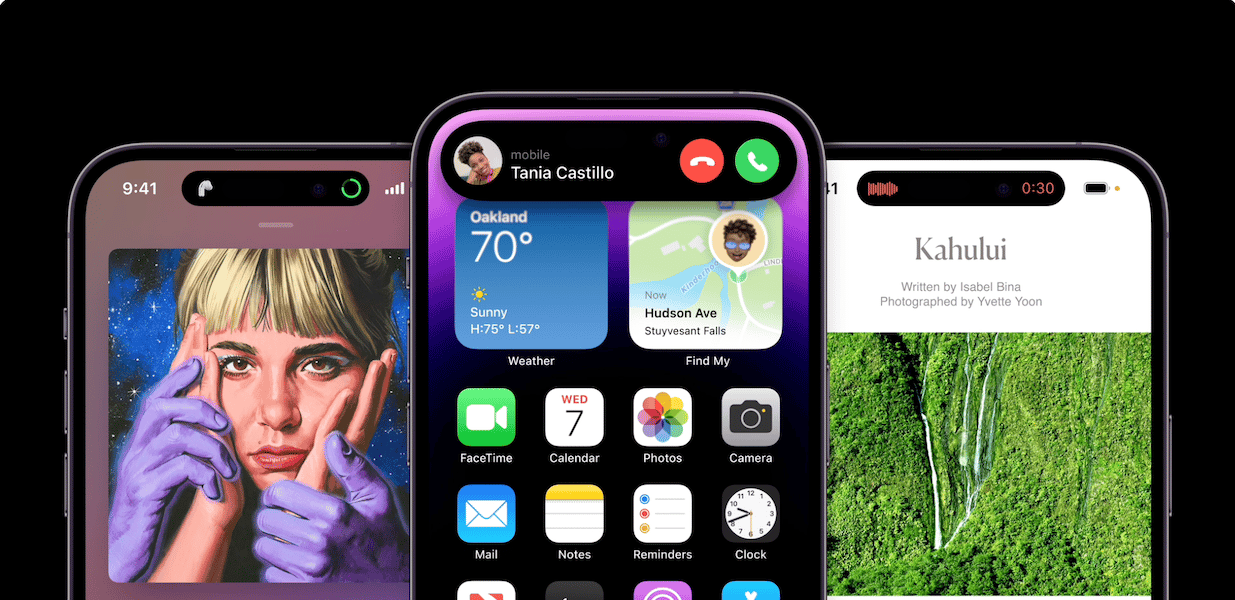
Poetically, Apple celebrated iPhone’s 15 anniversary by releasing the new milestone product the iPhone 14 Pro. Amongst the several innovative features on the latest Pro lineup is the Dynamic Island, an interactive space, that blurs the boundary between hardware and software.
To talk more about the concept and creation processes of iPhone 14 Pro Dynamic Island, AXIS spoke with Apple Vice President of Human Interface Design, Alan Dye, and Senior Vice President of Software Engineering Craig Federighi.
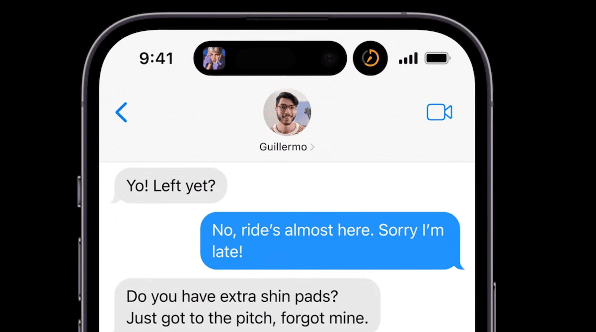
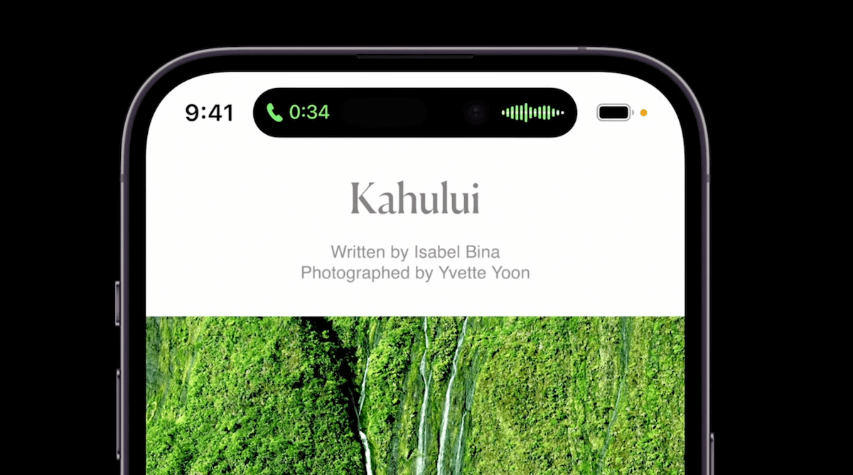
Dynamic Island is a new always-on interactive space on the top of the new iPhone 14 Pro models, which serves multiple purposes; it comes alive when users sign in via FaceID or make payment via Apple Pay, shows background activities like ride-hail, food delivery, and minimizes current apps so that they don’t take over the complete Home Screen like audio calls, music and more. In short, has changed how users interact with apps on their new iPhones.

iPhone 14 Pro Dynamic Island “erases boundaries between hardware and software”
iPhone 14 Pro’s new Pill + Hole shaped notch is the first major change introduced since iPhone X’s launch five years ago which creates extra space on the top of the mobile. Dye explained that the hardware achievement led to the development of Dynamic Island.
“At Apple, it’s very difficult to trace the origin of an idea because our work is built on a huge number of discussions with different groups of people. There was a question of what could be done with the extra space if the top sensor area could be made smaller, and it’s one of those discussions that’s been going on for years, not the last year or so.”

In the effort to display information in a “very elegant and yet very useful way”, the Apple design team realized that animation should not be limited to the status bar area only, and a little bigger space would let users know what they are doing.
This is an example of a big breakthrough and I hope people who use it will feel the effect because it makes the experience feel so smooth and natural. This is because we have put a lot of care and skill into design and engineering, and have repeatedly brushed it up.You forget that there is a static physical hardware, and the whole is a dynamic software like a fluid. Our goal was to make you think.”
Explaining why Dynamic Island makes it feel more like magic than just animation, Dye said that the design team and hardware teams were able to erase the boundary between hardware and software by making sure that when users tapped on the Dynamic Island it was properly recognized.
Many people think that the area where the camera is is also part of the display, and this area can also be tapped to operate. But it’s not really a display and it doesn’t have a capacitive touch sensor built in.

Federighi recalled that the audience’s first impression of Dynamic Island was “surprise” and the groundbreaking feature has given an iPhone a completely new identity.
“At the Steve Jobs Theater (where the presentation was held), the moment this function was projected on the screen and the sensor area swelled to display the status, everyone at the venue held their breath and fell silent. I heard a voice of surprise.
It was the same when we first saw this feature inside Apple. For me personally, it felt like the iPhone had a new, living identity. When you swipe up on an app, it absorbs it and the island bulges a bit. It’s a very delicate animation effect, and although it’s a bit different from anthropomorphic, I think it gave the iPhone a new, strong personality and vitality.”
Read More:


