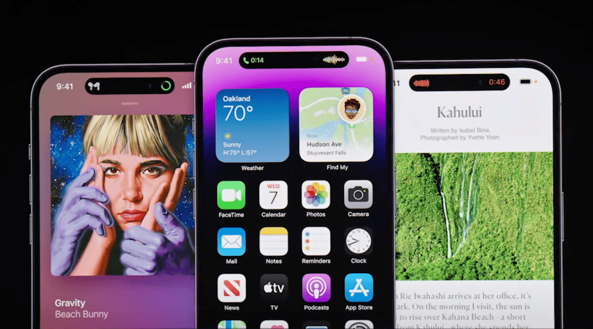
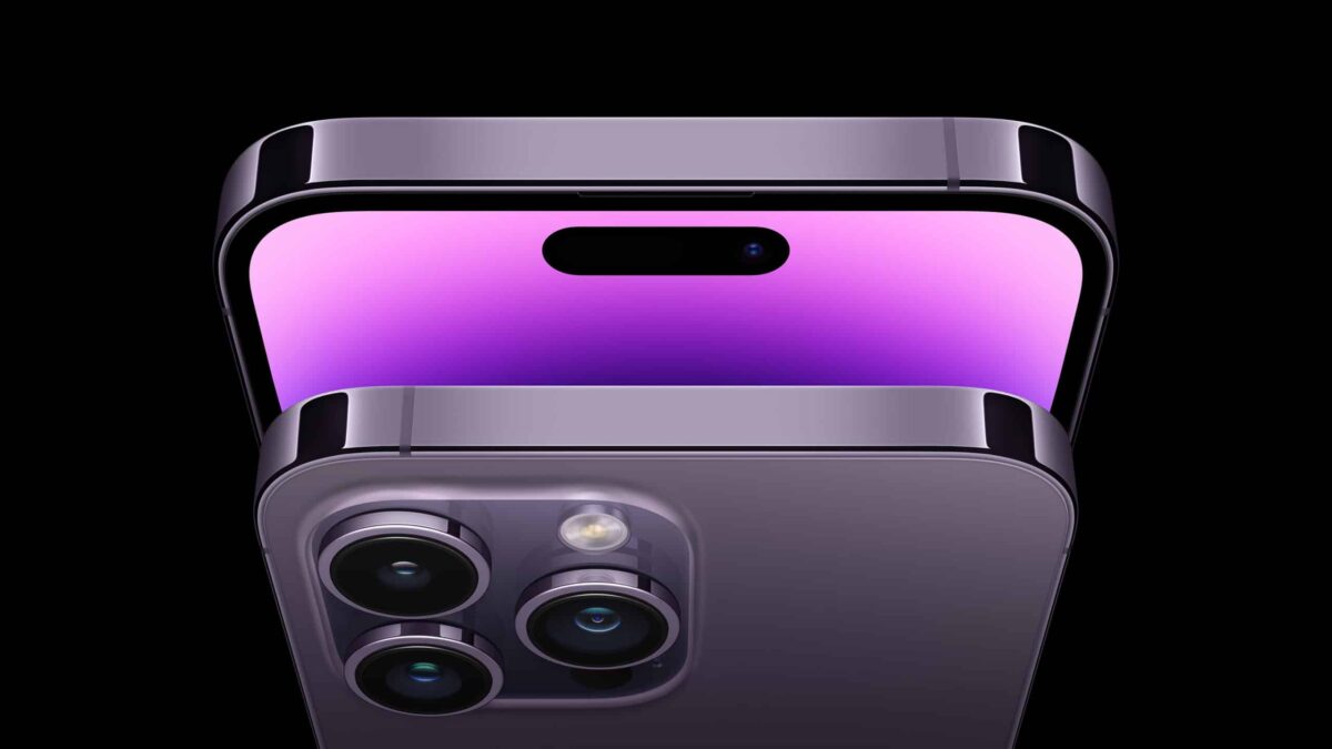
Apple’s new iPhone 14 Pro and iPhone 14 Pro Max are finally in the hands of consumers. Powered by the A16 Bionic chip, the Pro models feature a new camera cutout for the display called the Dynamic Island, an always-on display, significant camera system upgrades, and much more.
According to the first batch of reviews published, the iPhone 14 Pro offers incredible performance and is chock full of new ideas as well as innovation but there are some rough edges to be figured out by Apple.

iPhone 14 Pro reviews are out!
The Verge’s Nilay Patel says that the “Dynamic Island is a potentially good idea that’s waiting for the next step.” Patel goes on to say that the iPhone 14 Pro feels like the “first glimpse of an entirely new kind of iPhone,” but there are things to be improved.
The iPhone 14 Pro, on the other hand, is the clear beginning of lots of new ideas, like the Dynamic Island, the new camera, and that satellite connectivity system. Because these ideas are new, they’re inherently incomplete. But they’re worth criticizing, which is its own kind of victory and a sign that Apple isn’t holding still with the future of the iPhone. I think we could all stand to think more deeply about how our smartphones work, and things like the Dynamic Island are evidence that Apple is still thinking deeply about parts of the iPhone experience.
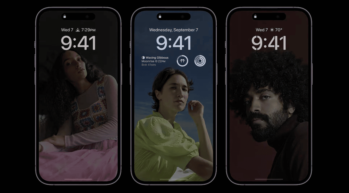
According to CNET’s Patrick Holland, Apple managed to upgrade its Pro iPhones in both large and small ways without raising the price. Holland’s review focuses heavily on the iPhone 14 Pro’s always-on display and how distracting it was.
I wish there was an option to make the always-on display look more discreet and, for example, just show the time and date. Technically, you could probably set a black wallpaper as your lock screen and only select the date and time for a more minimal always-on display. Visually, the 14 Pro’s always-on display has a lot going on which I found distracting when my phone was face up next to me.

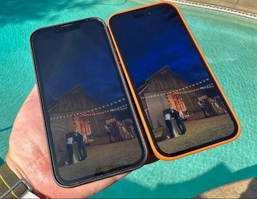
As for the display itself, TechCrunch’s Matthew Panzarino says it is noticeably brighter. Panzarino also provided a comparison between the display of the iPhone 14 Pro and its predecessor, the iPhone 13 Pro.
The display is noticeably brighter in daily use. Not enough to feel like a violent change from the iPhone 13 Pro but even then there is a delta and it’s more than on paper – it’s brighter, period. Apple claims it can spike to 2000 nits but for most people that’s a pretty random number.
To give you at least some comparison, I shot an exposure locked frame from an iPhone 14 Pro Max of the same image displayed on both the iPhone 13 Pro (left) and iPhone 14 Pro (right). I believe the resulting shot gives a fair approximation of how much brighter the iPhone 14 Pro’s screen can look in direct sunlight.

According to WIRED’s Julian Chokkattu, the 48-megapixel camera system the iPhone 14 Pro comes with is impressive but the “improvements aren’t as dramatic as the company suggests.”
The last time Apple changed the megapixel count of its main camera was in 2015 with the iPhone 6S. Now, the main camera takes another leap. The photo sensors on last year’s models captured 12 megapixels of image data, but the cameras on the iPhone 14 Pro and iPhone 14 Pro Max grab 48 megapixels. More megapixels doesn’t mean a better photo, but it does mean the ability to capture more detail (and print your photos in larger sizes). It, along with a new image-processing pipeline called the Photonic Engine, is supposed to represent a sea change for the iPhone camera. Unfortunately, I’m not noticing a big upgrade in any meaningful way over last year.
The Wall Street Journal’s Joanna Stern says that the iPhone 14 Pro does not offer a dramatically longer battery life than the iPhone 13 Pro.
As far as battery life goes, none of the iPhone 14 or 14 Pro models I tried lasted significantly longer than their predecessors. The story might be different with the step-up model, the iPhone 14 Plus. Apple says it has “our longest battery life ever”—I’ll test that claim when it arrives.

Chokkattu goes on to note that you can capture a 48-megapixel image with the camera and while the image might not look better compared to last year’s iPhone, the number of pixels it has can give photographers granular control over editing them.
If you want to utilize the full 48-megapixel sensor (and deal with the larger image file sizes), then you just have to tap the “RAW” button at the top of the camera app. This nets you greater flexibility when editing, as you have more control over the saturation, contrast, brightness, and shadows of the image. I generally felt like I had more to work with in 48-megapixel mode, which often produced cleaner images with more detail.
In reference to Apple ditching the physical SIM tray in the iPhone 14 lineup, Endgadget’s Cherlynn Low says it could give carriers in the United States the push they need to adopt the technology. Low also highlights how she only had to wait for a couple of minutes to activate her eSIM. However, Low says it does not make sense why Apple is embracing eSIM as a way to move forward while not adopting USB-C connectivity for iPhone.
It’s funny that Apple has thrown caution to the wind and fully embraced eSIM before it adopted USB-C, though. The charging standard is more prevalent and would make many people’s lives more convenient. This is one area where the iPhone 14 Pro feels stuck in the past.
Conclusion
In conclusion, the iPhone 14 Pro’s Dynamic Island is one of the best features we have seen from Apple in quite some time but will take a bit of refinement to reach its fullest potential. In addition, the always-on display can be quite distracting and it does slightly impact battery life. Lastly, the camera upgrades are impressive but it is not a gigantic difference for the average user.
If the new Dynamic Island, camera upgrades, slightly better performance, etc, are important to you, the iPhone 14 Pro is a solid choice that builds upon last year’s iPhone 13 Pro while offering some level of innovation.
MKBHD’s review:
WSJ’s review: