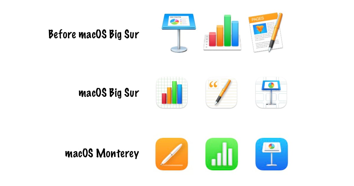
Apple is working on improved icons for its iWork productivity suite of apps which includes Pages, Numbers, and Keynote. The company had revamped almost all icons in macOS Big Sur, and some of them received a lot of criticism because they replaced icons that were beloved by all users.

macOS Monterey’s new iWork icons still miss the mark
MacRumors found the new iWork icons in iMessage app framework that renders collaboration links for apps in macOS Monterey beta 5. The icons were currently in a low resolution but it is pretty obvious that Apple is updating them with some inspiration from their iOS and iPadOS counterparts. These new icons get rid of the white backgrounds that the current iWork apps have and replace them with solid background colors and which iOS users would be familiar with.
Unlike the iOS app icons, the new iWork icons in macOS Monterey have more detail and depth. The icon imagery does not include the use of plain white glyphs but neither does it include as much detail as current icons in macOS Big Sur – it is somewhat in the middle. The Numbers icon gets rids of the colors in the graphs while the pen in Pages icon is also mostly white. The Keynote icon podium also has fewer colors than before, with the blue podium replaced by a white one.
We are not sure that users would like the new icons as one of the best things about macOS was its use of photorealistic icons which did not have to be confined in specific squircle shapes with solid background colors.
Read more:
1 comment
Comments are closed.