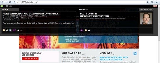
Microformats are about enhancing the web, representing data in HTML and moving that data around. Oomph: A Microformats Toolkit is for web developers, designers and users, making it easier to create, consume, and style Microformats. In short, Oomph makes consuming and producing content for the web just a little easier, more efficient, more fun.
In short, Microformats, or rather Oomph adds a whole new dimension of interaction with websites. It lets you create a very visually pleasant and unobtrusive way of displaying your data. The data can range from events, to contact cards and mapping locations. All that without making the user leave your website, or navigate to some other link on you website. Straight from the Mix team:
With the momentum of Microformats burgeoning, we decided to build Oomph: A Microformat Toolkit. Our main goal with Oomph is to make Microformats more accessible for developers and designers. Oomph is an amalgamation of applications: an Internet Explorer Add-in built in C++ that finds Microformats on a page; a cross-browser HTML overlay built using JQuery that aggregates Microformats; a set of beautiful CSS styles for Microformats; and a Windows Live Writer plug-in written in WinForms for inserting hCards. And, the entire project is up on Codeplex, ready for community contribution and extensibility.

| What: | Lol cats A lol cat at ibrokesomething.com? Oh noes! |
| When: | Thursday, February 26, 2009 3:00 AM |
| Where: | ibrokesomething.com
Testing Address
DisneyLand, |
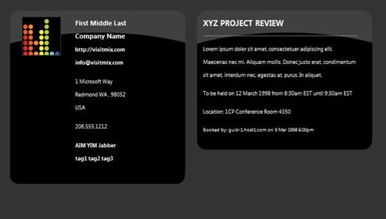
This is a very simple look for the cards which can be customized to look flashy and more appealing, such as this:
Looks interesting to me. It could provide a gateway to a whole new world of tools – something what we webmasters are always in search for! :) Nice share.
This is awesome, should help building communications and social interactivity. :)
Btw, those Desi wallpapers thing.. WOAH !