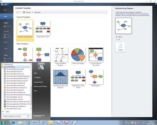
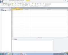
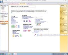
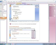
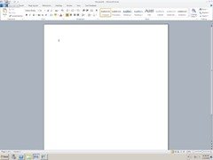
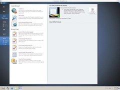
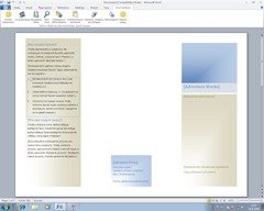
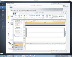
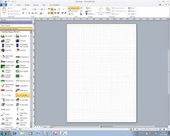
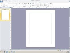
Office 14 alpha was recently released to TAP, and the screenshots have already been leaked by a Russian website WZor.Net. The UI looks a lot whiter, just like the new Windows 7 explorer and Windows Live apps UI. According to Stephen Chapman, Office 14 will be called Microsoft Office System 2009, which points out to a release this year.
The Fluent UI, or commonly known as ‘Ribbon’ is still there and now it’s spread among all applications of the Office System 2009 unlike in Office 2007, where Outlook, Visio and some other applications retained the older file menu UI. It seems to make for a uniform UI across all the applications now.
Check out the rest of the screenshots after the break.

testing
I’m glad they’ve decided to add the ribbon to the whole office suite but I really hope it doesn’t look like that in the final release… all the changes I can see they’ve made make it worse. (The top left wouldn’t be as easy to use and the white look is horrible)