Apple’s new OS X 10.7 Lion brings many changes to the interface, one of which is the ability to use certain applications full-screen. Due to this new feature, may of the included applications in OS X have been redone. Here’s a look at the apps that have changed, and the benefits their change brings.
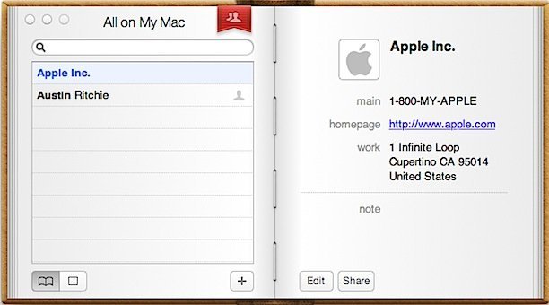
1) Address Book. The new Address Book has been given a small face-lift, so to speak. It looks more like a book, and it adds a nice aesthetic element to the user experience. Performance-wise, there does not seem to be a major difference.

2) Safari. At first, the new Safari looks and feels just like the previous version. In full-screen, however, the difference is apparent. Both the Dock and Menu Bar are gone, leaving you a gigantic amount of screen real-estate to surf with. This change is very welcome, and will make the browsing experience much more enjoyable.

3) Preview. While it may not seem like a big deal, the Preview application has been revamped. In full screen, you are left with only the image, unless you mouse-over the left side of the screen to pull up the list of opened pictures.

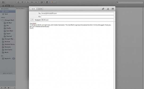
4) Mail. The new Mail brings an experience that is similar to the iPad’s mail app. Mail is organized into conversations, just like iOS. The new organization helps sort mail and get through it faster, and having the full-screen at your disposal makes email much easier to read and sort.

5) Calendar. The remade calendar takes advantage of full-screen capabilities and displays scheduled events and the calendar in a way that is easy to navigate. You can find everything you need on one screen without hassle, which makes scheduling and checking events much more efficient.

Stay tuned for more updates on new OS X Lion features and changes!