Some time ago, it was announced that a new Twitter website will be released on 14th September. Twitter has a webpage that shows the new features and interface . The improvements have made Twitter easier to use and with interface re-map, things feel better than before. The only setback of the new twitter is that it has added a few seconds to the loading time.
Here is our short review on how twitter has changed and the new features it has acquired.
- From a single column, Twitter has moved to a two column layout which has made multitasking on Twitter simpler and without the need opening a separate Tab/Window. The second column can be used for viewing profiles, conversations, and media.

- We can now view Images and Videos within the Twitter website. Twitter supports services like Twitpic, Pixli, Youtube, Vimeo, etc.
- Twitter now features a new favicon (not a modification in the ‘t’). This time, they have gone with the Twitter bird and it looks far better than before.
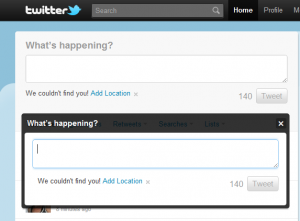
- Update box has also undergone modifications as well. It now supports username suggestions and an option to turn on/off Geo-tagging.
- Now we can view conversations in the second column just like third-party Twitter clients.
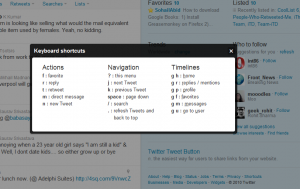
- To make things simpler, twitter has added keyboard shortcuts. One can use these shortcuts to update new Tweets, reply, retweet, DM etc. Some of these shortcuts need the Shift Key to be pressed before the hotkey is pressed (Shift+Hotkey)
The new Twitter website is being welcomed by every user (who has access to it) as it takes a step forward with the website overhaul.


Need new model of a twitter.