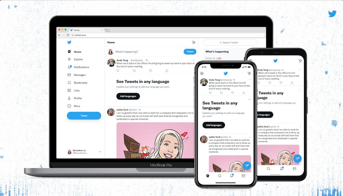
Recently, Twitter introduced new visual changes on its web and mobile apps and users are not happy. A new typeface ‘Chirp’ for western languages and high-contrast buttons is designed to bring more accessibility, uniqueness, and focus on what users are doing on the app. However, these are not the changes users were hoping for.

The announcement by the Twitter Design team reads:
We released a few changes to the way Twitter looks on the web and on your phone. While it might feel weird at first, these updates make us more accessbile, unique and focused on you what you’re talking about.
We’ve updated our colors to be high contrast and a lot less blue – a change made to draw attention to the photos and videos you create and share.
Our new buttons are high contrast too. Now the most important actions you can take stand out. Yes, the follow buttons look different, but they’ll help you see what actions you’ve taken at a glance.
The, overwhelmingly, negative feedback of new Twitter changes complies the company to reconsider
The company began testing the newly launched typeface ‘CHIRP’ in January 2021 to deliver a font that is sharp and has good density, so it is easy to read in everyday use and offers “personality and distinctiveness”.
But several users are complaining that its font makes the text harder to read with its blob-like appearance which makes it hard to read the text.
Did you consult with visually impaired peoole? Helvetica is a great text for its simplicity. That you’ve made letters curlier with gaps in letters closer together so they are less distinguisabke is inaccessible. The g is awful. What about those with dyslexia too?
— TannersTavern (@TavernTanners) August 11, 2021
https://twitter.com/belleeeey_/status/1425516739668938754?s=20
Several users complained of headaches with the new font design and expresses that the new color scheme for buttons does not make sense. And some are hoping that the company reverts the changes like it shut down ‘Fleets‘ features due to lower than expected users’ responses.
https://twitter.com/remiakers/status/1425600541007167489?s=21
Luckily, the negative impact of visual changes has been so strong that the company is reconsidering the new buttons with high contrast.
We're making contrast changes on all buttons to make them easier on the eyes because you told us the new look is uncomfortable for people with sensory sensitivities. We're listening and iterating.
— Twitter Accessibility (@TwitterA11y) August 13, 2021
The update also included a new clean and simple user interface with less visual clutter like gray backgrounds, “unnecessary” divider lines, and more space to make it easier to read the text. Even these changes were not received well. A user wrote that without dividers, the test appears as a single block of text.
https://twitter.com/daveranan/status/1425507488292540416?s=21
Read More:
2 comments
Comments are closed.