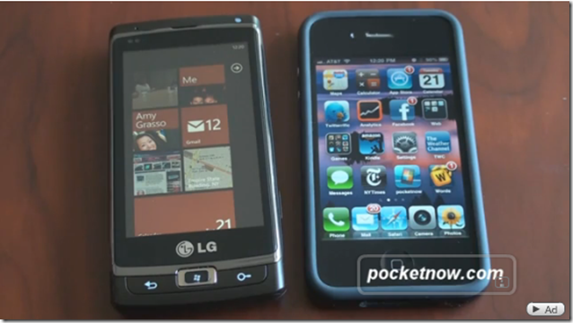
In a new video, the guys at Pocket Now have compared Windows Phone 7 to iPhone. This is a closer look at how the iPhone differs from Windows Phone 7. As the video mentions, the home screen layouts are completely different. The iPhone goes for the all about the applications look but the Windows Phone 7’s home screen covers all areas of the phone using Tiles which can show live data.
The video also covers fast app switching or the lack of it in Windows Phone 7. And then finally its all about the music play controls where they think that Windows Phone 7 seems to be a bit more intuitive than the iPhone. It turns out that you use the volume button as a multi-use media button. This is very helpful to play music when on another application.Watch the video to find out more!
[Via Pocket Now]