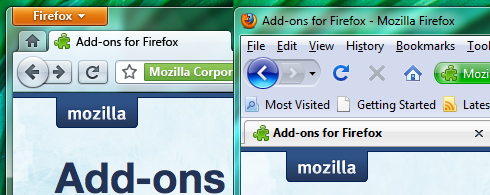
The updated UI for Firefox 4.0 contains a new App Button similar to the file menu drop down button in the Paint and WordPad apps in Windows 7 or in Office. This will replace the file menu. Navigation buttons have a slight shade on them and look glossy. The other changes that were seen in the older Firefox 4.0 mockups as well are the inclusion of glass and tabs above the address bar.
This is how Firefox 4.0 would look like compared to Firefox 3.5. Big difference, eh?

Currently, Firefox has the ugliest UI of all browsers. I’m a Firefox user myself, but can’t wait for version 4, when it’ll be able to compete with other browsers in the looks department.
[via GeekSmack]
“Currently, Firefox has the ugliest UI of all browsers”
I completely agree.
The thing is that no open-source applications have good default UIs (just think about it). Why? Because the default UIs/themes are created via collective thinking/collaboration, which results in the worst UIs imaginable, and the more people are involved, the worse the result.
3.6 is in early 2010 .. so I guess 4.0 will be in mid or late 2010 ??
thanks for sharing the kool screenshots
thanks for sharing the kool screenshots