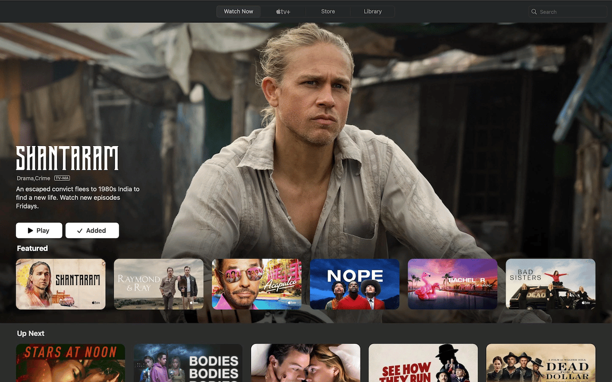
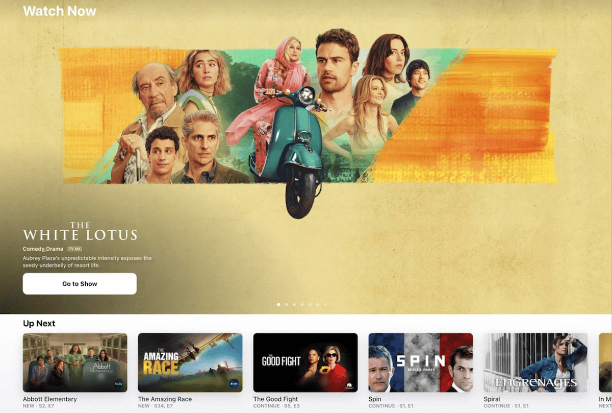
Apple TV app got a design change on iOS 16.2, iPadOS 16.2, tvOS 16.2, and macOS Ventura 13.1. Now, the “Featured” row or section on the TV app displays Apple TV+ original content. Even at the time of release, users expressed discontent with the changes and complained that they were introduced to the market company’s own content.
Nearly a month after its launch, users still continue to express dislike for the new design which blatantly promotes TV+ movies, and shows.

Apple TV app is now a marketing tool for TV+ promotion
Apple TV app moved the “Up Next” row in the “Watch Now” tab and kept the “Up Next” row at the bottom of the “Watch Now” tab which is irksome for many users as there is no option to disable it.
Furthermore, the previews of movies and shows also autoplay content with sound, and the majority of the UI displays TV+ “Featured” content which makes the app a marketing platform for Apple’s own movies and shows. Reddit users expressed strong disapproval of the changes.
@Sean310 wrote Apple TV app shows 85% of TV+ content.
I absolutely HATE the new format.
And they roll right into previews with audio. WTF Apple?
Up Next is tiny now & easily skipped over (on purpose).
And when you are on the Up Next row, the same Apple TV+ shows take up 85% of the screen below.
@jason_ferguson said that the new interface is terrible.
It is TERRIBLE especially since even before the change, the whole app seemed like an advert for ATV+ content. Now it’s absolutely unusable. Two whole tabs dedicated to ATV+ … disgraceful.

@MitchOfGilead complained that it was frustrating to use the Apple TV app.
This is the part that is the most frustrating to me, from a UI standpoint. So the thing I’m gonna be using the most will be stuck at the very top of the screen, while my eyes are accosted by 85% of ads for Apple TV+ shows at the bottom of the screen?
It’s just so awkward looking and bad to use.


