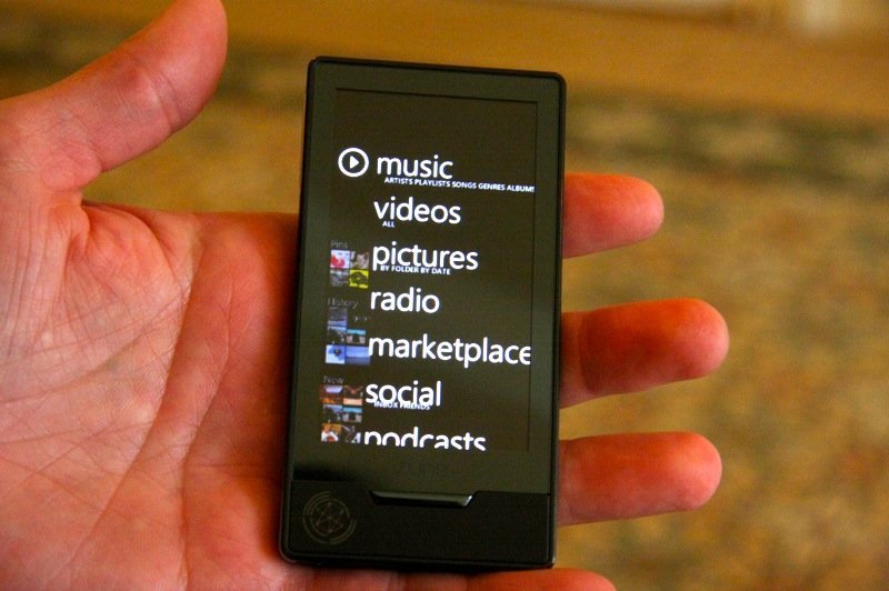
Videos of Zune HD are already popping up around the Internet from the D7 conference. While Engadget had gotten hold of some images while Steve Ballmer demoed a prototype of a platinum Zune HD, Gizmodo and CNET made videos. The UI looks sweet, with nice transitions that zoom into each option in the main menu. Gizmodo even went on to say
The device is tighter and more physically beautiful than the iPod Touch and it’s got a better UI, the main menu’s scrolling so natural through the swipe gestures.
The OLED screen looks brilliant, and its somewhat lower resolution than the iPod Touch doesn’t seem to be a problem at all. The video, pictures and music features have been demoed on video so far. I personally think that the browser and apps could make it or break it for the Zune HD. That’s the major selling point for the iPod Touch. Hopefully Microsoft would do a good job at that. Fingers crossed!
Check out more pictures on Gizmodo and Engadget and another video on CNET.

beautiful Microsoft Zune HD – http://tinyurl.com/my59lq