I know I’m going to hurt a lot of people with this post, especially those wanting Windows 7 to be released ASAP. I’ve been using Windows 7 Beta daily, and couldn’t help but notice how Microsoft seem to have made critical mistakes in putting thoughts behind some simple issues. While I praise them for going with a very consistent UI through out the operating system as well as Windows Live applications, which also shows somewhat in the Office 14 alpha screenshots leaked so far, some of the little things just annoy me a lot. Because let’s face it, it’s the little things that count, and make a great impression on the user, things like Aero Snap and Jump Lists. But let me list the little things that could have been done more properly.

Explorer Title Bar
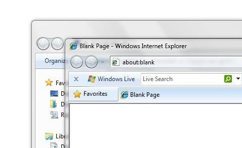
In the above screenshot, there’s a very small but obvious change from Vista to Windows 7. The title bar has no text in Windows Explorer in 7, but it is present throughout all other applications. Windows Explorer doesn’t even have the little icon in the top right corner to show what it’s about. In Vista and before, it used to show the correct icon for the Pictures, Videos or whatever folder you were browsing. Why this change Microsoft? I’m sure there went a lot of thought behind this change, but sorry to say, it seems ridiculous. How’ll you feel if developers stopped putting title bar in Windows applications? I mark this change as a fail.
Folder View Settings
In 7, folder view settings aren’t saved on a per folder basis. If you change the view of a folder in your Pictures library, it’ll change the view of ALL your folders in that library! How crazy is that! And from what I’ve read, this isn’t a fault, it’s by design. It’s meant to be like this. Microsoft has gotta be kidding us with this one! First, the forgettable folder view settings in Vista, which they never bothered fixing as far as I know, and now this. Why does Microsoft has to keep meddling with this, when there are more important things to fix and work on in Windows?
Windows Live Messenger in the Taskbar
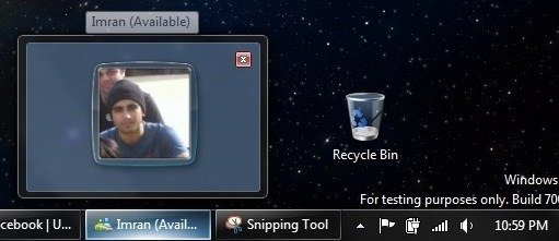
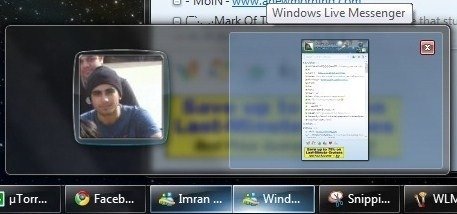
 This is actually related to Windows Live, but due to the new Superbar, it is more of a Windows 7 issue than anything else. If you change your taskbar settings in Window 7 to not group any Windows, this is how you’ll see your Messenger taskbar button and its live preview. Note that this is when the Messenger is closed using the close button and not minimized. But, what if you just minimize it? This is what you get:

That’s right. Two taskbar buttons for Windows Live Messenger, with one of them just wasting space. I know it feels cool to have your display picture in the preview window, but it’s just a useless waste of valuable space on the taskbar. And, since Windows Live Messenger is not in Beta and was released as a final version ages ago, this won’t be changing. Another weird design issue in Windows 7.
Preview Pane in Windows Explorer
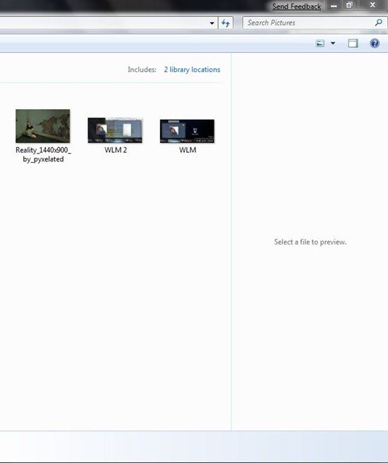
 I’ve not seen many people who appreciate or like the preview pane in Windows Vista/7. It’s turned off by default, and apart from the games folder, it’s just plain ugly. Try using it in any of your folders, and it’ll start popping up in all folders you browse! Is that really useful? No. I, for one, do not want it popping up in my Documents (or any other folder for that matter) at all, when I just want it for my pictures folder. Windows Vista had this same issue, and 7 moves the legacy forward.

Not everyone might care about these issues, but I and many others that I know want these to be fixed. These little things have to be fixed in Beta. If not, then it could be a very useless Beta for a very promising operating system.
*sigh @Firefox*
Wow.
@Explorer Title Bar
Check your address bar. http://www.google.com/search?q=define:redundancy
@”Because, lets face it, its the little things that count, and make a great impression on the user.”
System stability isn’t a little thing. Nor is overall performance.
BS on the repetition thing for explorer title bar Tommo. The address bar will not show all the address as the path gets too long, and it will not show the address bar if I cascade my windows… Just make the title bar wasted space – very very stupid in my opinion, but pretty much what I have come to expect from them with changes now… Fine if they make a way for those of you who don’t want the option, but why take it away for those that like it – unless we want to go to classic view of course… I am going to be using a third party explorer like XYPlorer… Only fix I found so far for adding the path back to the title bar is a utility called Aerobar, which will work, but looks to have a trojan downloader in it…
Tommo: I’m very happy with the performance and stability, but that’s not the focus of this post. It’s the UI. I know I’m nitpicking here, but these things are on the top of my wishlist to be fixed/changed for the Windows 7 RC.
And redundancy is present through out the UI of Windows. Most applications in the Accessories folder have it. So, why change just Explorer?
I see your point but Explorer isn’t so much an application as it is an integral part of the Operating System.
Also, the navigation pane may as well be a sitemap.
They took the icons in the corner of Explorer windows out of the title bar in Windows Vista. I run Vista and it’s a little annoying to try and remember which explorer windows are which, but you get used to it.
I see your point but Explorer isn’t so much an application as it is an integral part of the Operating System.
Also, the navigation pane may as well be a sitemap.