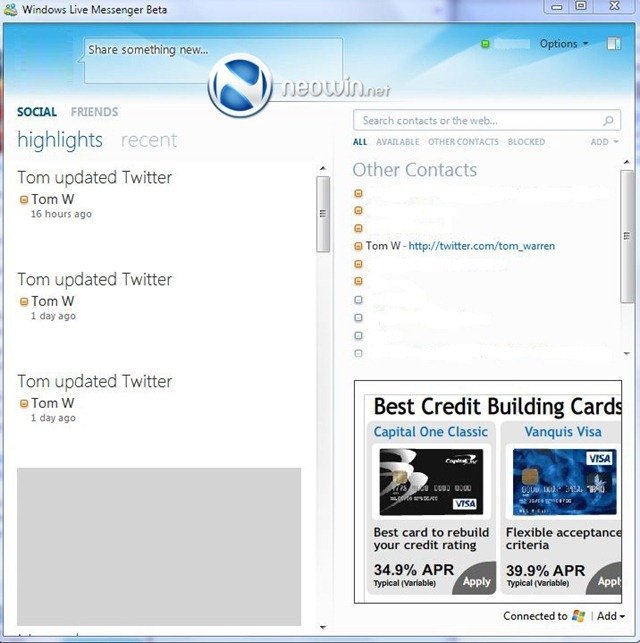

The contacts column also has a Zune-ish redesign and instead of a drop down list, it contains quick links to alternate contact lists such as ‘other contacts’ and ‘blocked’. There’s also a huge share box at the top, similar to the Facebook share text field. I hope this would let you publish to your social service directly from Messenger, but then that is yet to be seen.
If you notice closely, the bottom right of the window says ‘Connect to *Windows Live Logo*’. There seems to be an option to ‘Add’ more services along with it since an option to add contacts is provided next to the links to alternate contact lists. I wonder if Microsoft plans to open up Messenger to more services, or maybe allow us to link to Facebook or Twitter. This is all just speculation on my part, but it seems possible from the screenshot.


And finally, Windows Live Writer 2010 shown above with the much-anticipated Ribbon upgrade. This is probably the best product in the Windows Live Essentials lineup, and the inclusion of ribbon will make it more productive to use.
We expect official information to be revealed on Windows Live Wave 4 at the Consumer Electronics Show in January. Hopefully, Live Mesh will get some focus too then. Stay tuned!
Gosh it's ugly! Have you ever seen an IM program so big-assed? ICQ, Yahoo Messenger, AOL – they all are thin and vertical. The only exception is Skype but then… it's designed to occupy the entire screen for video calls anyway. And this is just wrong. An IM program shouldn't take more than 1/3 of the computer screen.
I wouldn’t want to use is if it stays that big in the final version too. Let’s just hope it changes.
Gosh it's ugly! Have you ever seen an IM program so big-assed? ICQ, Yahoo Messenger, AOL – they all are thin and vertical. The only exception is Skype but then… it's designed to occupy the entire screen for video calls anyway. And this is just wrong. An IM program shouldn't take more than 1/3 of the computer screen.