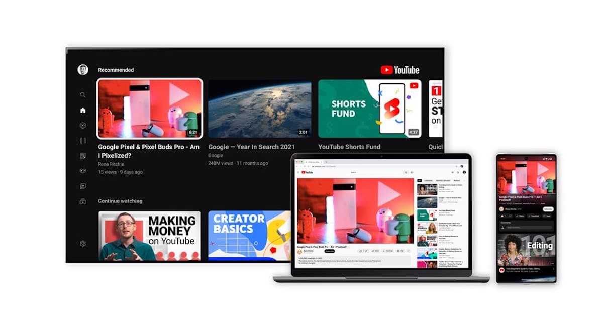
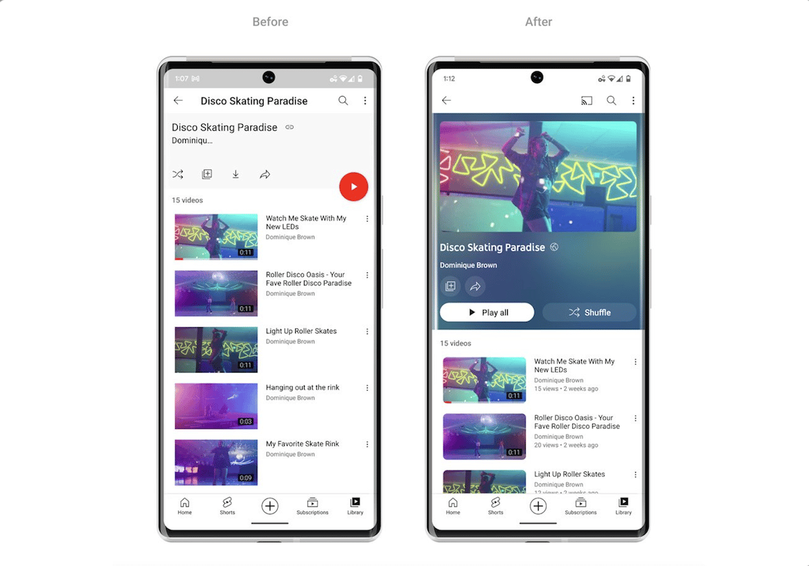
YouTube is updated with a new lively design with a new ambient mode to deliver sharper colors, pinch to zoom, precise seeking, and more to offer users a modern and immersive viewing experience on its mobile, web, and Smart TV apps.
Recently, the company announced the end of an experiment to paywall video streaming in 4K behind Premium subscription and YouTube Music added new Lock Screen widgets on iOS 16 for users to quickly play their most recent songs, playlists, videos, and other media.

Everything to know about YouTube’s new design and features on mobile and web
In the next few weeks, the following new look and features will be available on YouTube, worldwide:
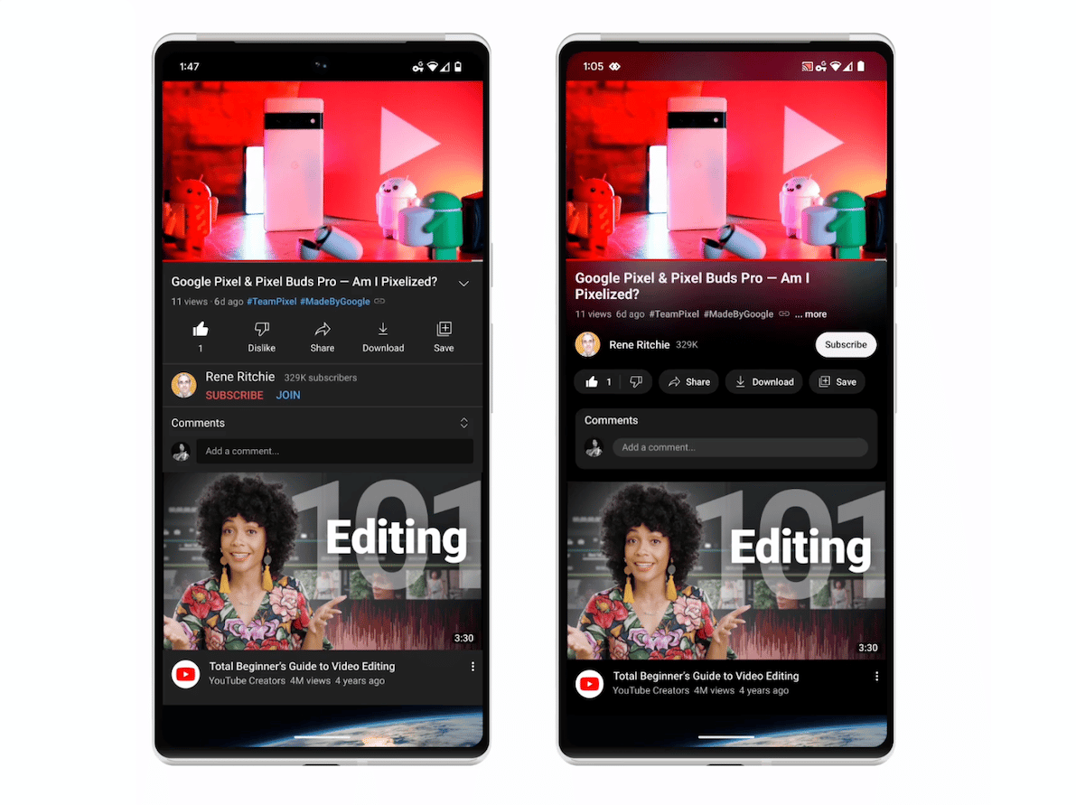
- Ambient mode uses dynamic color sampling that adds a subtle effect on the app’s background color to match the currently played video. The new mode will be available in dark theme on mobile and web.
We were inspired by the light that screens cast out in a darkened room and wanted to recreate the effect so viewers were drawn right into the content and the video takes an even greater focus on our watch page.

- Dark theme is now darker for the colors to pop more on the screen. The updated dark theme will be available on mobile, web and Smart TVs.
- Pinch to zoom on mobile will allow users to easily zoom in and out of videos.
- Precise seeking adds the easy “drag or swipe up” functionality to find and play a particular part of a video, easily and quickly. It will be available on mobile and web.
Precise seeking builds on our recent improvements to video navigation that help you quickly find the parts you’re most interested in. We launched the ability to long press anywhere on the player to seek and to double tap with two fingers to skip chapters. We also added a graph that shows frequently replayed moments in a video.
- Redesigned watch page replaces YouTube links in video descriptions with buttons and minimizes frequent actions such as like, dislike, download, save and share to remove distractions. It also redesigned the subscribe button with new color and shape to make it more accessible on watch pages and channel pages.

Chief Product Officer said:
When the first YouTube video was uploaded in 2005, YouTube had a search bar and a list of video tags on its homepage. Since then, you could say we’ve gone through some changes. In this latest installment of our Innovation series, we’re sharing a design update that will make YouTube more modern and bring new features to power the YouTube you know and love.


